PROJECT SNAPSHOT
FULL CASE STUDY
Overview
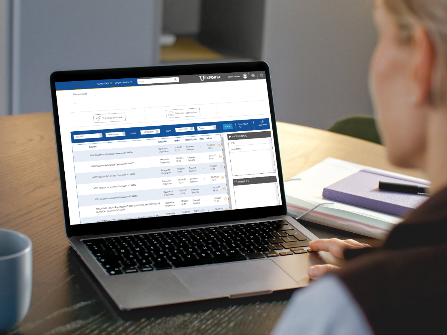
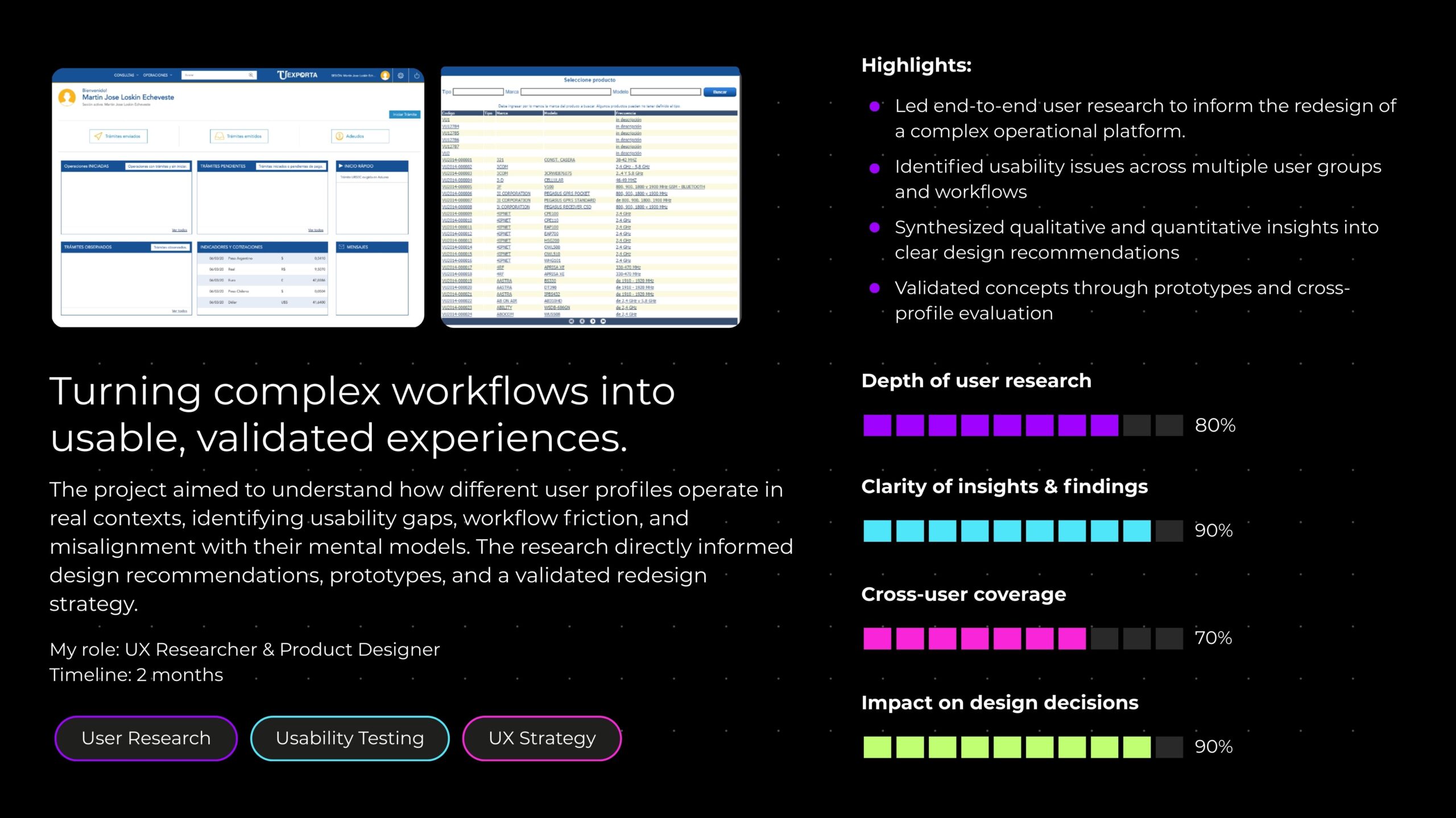
A national public-sector digital platform used to manage import and export procedures had accumulated significant usability issues across its core workflows. Despite being widely adopted by government agencies, intermediaries, and citizens, the experience had become fragmented and inefficient over time.
To guide a large-scale redesign, I led a structured research effort combining:
This case study outlines how research-driven insights and recommendations shaped a simpler, more effective user experience.
Research goals
Methodology
1. Contextual inquiry
We conducted nine in-depth sessions (three per profile) where users shared their screen and completed everyday tasks in the production or pre-production environment.
Focus areas included: home dashboard usage, search behavior, form completion patterns, workflow breakdowns, and external tools used to compensate for platform gaps.
2. Usability test of the new design
Users were shown prototype screens and asked to:
This allowed us to validate new UI patterns, wording, structure, and interaction flows.
Key findings by user group
1. Government agencies
Overall perception
Agency users were generally satisfied with the system and accustomed to its workflow. However, they relied on workarounds, repetitive tasks, and external spreadsheets to perform reporting or quota tracking.
Main pain points
Critical opportunities
2. Citizens
Overall perception
This group experienced the poorest UX. Even tech-savvy participants struggled with basic tasks such as starting a URSEC procedure or finding their certificate.
Main pain points
Critical opportunities
After testing the redesigned UI, citizens rated the experience dramatically better and felt tasks were significantly easier to complete.
3. Customs brokers
Overall perception
This group was satisfied overall but identified efficiency issues that slowed them down, especially with high volume workflows.
Main pain points
Critical opportunities
Cross profile insights
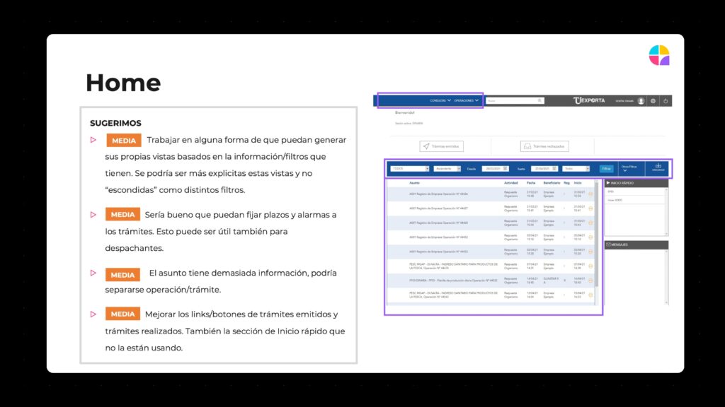
1. The home screen is overloaded
All groups struggled with the amount of information, acronyms, and underused sections such as “Quick Start.”
Creating personalized, simplified starting points was important.
2. Observations (comments) are a major friction point
Tracking and addressing observations lacked:
3. Terminology and labels often fail
Terms like “Homologation” “OCE” and form field concepts were unclear to non-experts.
4. Lack of continuity and deep linking
Users frequently got lost when navigating between emails, messages, operations, and certificates. Direct links were essential.
Impact of the prototype evaluation
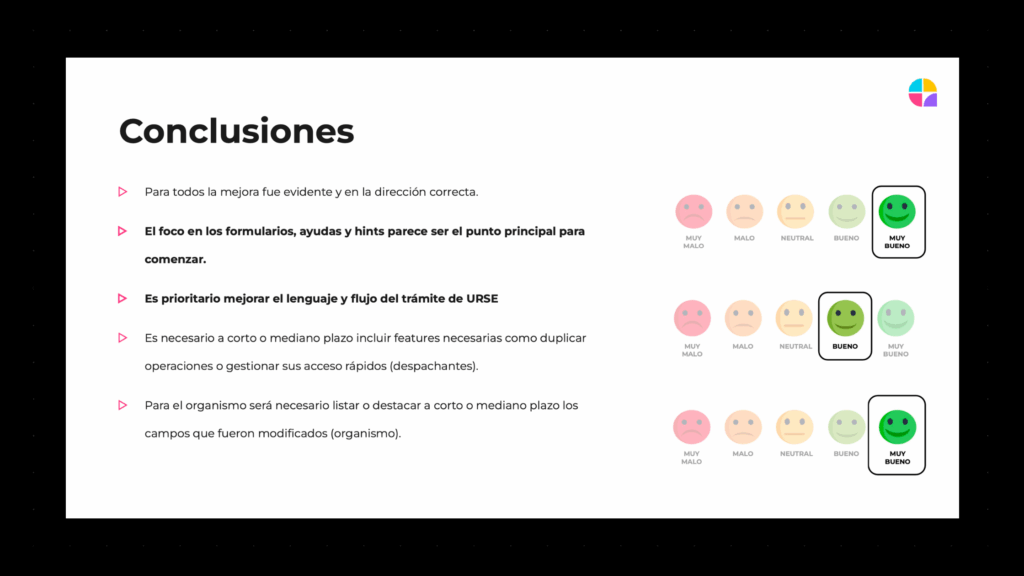
The redesign tested during interviews produced highly positive feedback:
Government agencies
Citizens
Customs brokers
Recommendations driving the redesign
High priority
Medium priority
Low priority
Outcome
The research helped the team move from assumptions to a shared strategy, shaping a simpler, more guided experience and defining the path for continuous product improvements.