PROJECT SNAPSHOT
FULL CASE STUDY
Overview
NOVA was created as an innovation hub meant to spark ideas, connect disciplines, and accelerate creative thinking. As a completely new brand, it needed a strong visual identity capable of expressing energy, ambition, and forward-looking innovation from day one.
The goal was to build a complete design system, logo, color palette, typography, geometric language, iconography, and photography guidelines, all unified under a coherent strategic vision. The result was the NOVA Brand Identity Manual, a comprehensive framework that defines how the brand looks, behaves, and evolves.
The challenge
The core challenge was to develop an identity that could:
1. Represent the innovative spirit of NOVA
The brand needed to feel modern, bold, and energetic, without relying on predictable “tech” visuals.
2. Create an abstract yet memorable logo
A symbol that could stand alone, evolve across contexts, and remain visually recognizable.
3. Build a modular visual system
Flexible enough to adapt to presentations, digital materials, documentation, events, and physical environments.
4. Maintain coherence and scalability
Every element, shape, color, type, icon, and imagery had to reinforce the same visual narrative.
Brand Strategy
The foundation of the identity was shaped by NOVA’s core values, explicitly outlined in the brand manual:
The manual describes NOVA as a “fragmented yet cohesive identity,” one that blends creativity, technology, and visionary thinking into a unified visual language.
Concept: The meaning behind NOVA
The name “NOVA” became the conceptual driver of the entire identity. As described in the manual, it references stellar novas, stars that explode and shine intensely, symbolizing powerful beginnings and transformative energy.
This inspired key design choices, including:
Design process
1. Logotype Development
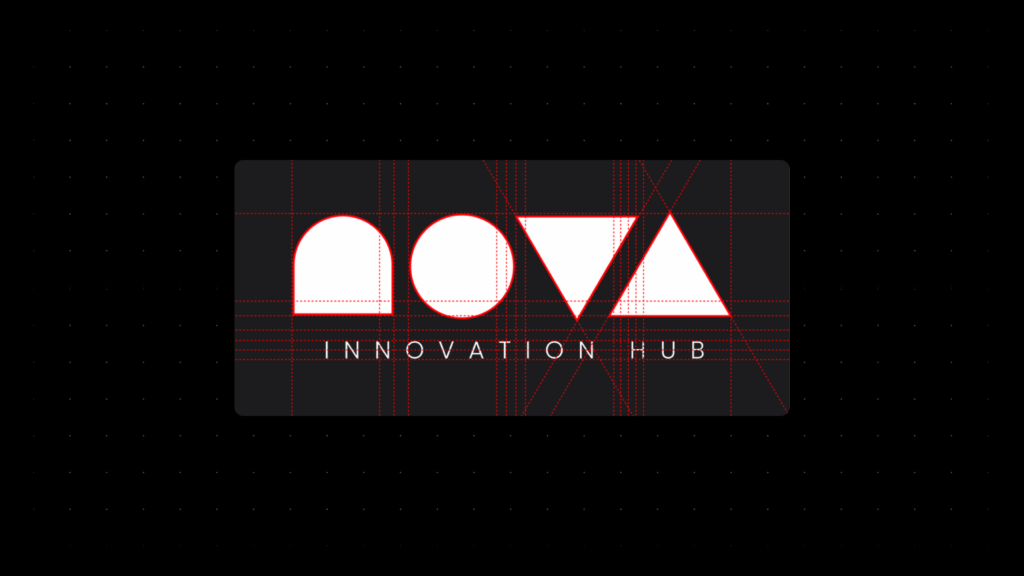
The logo is built using pure geometric shapes:
a semicircle, a circle, and two triangles.
The manual documents the construction grid and proportional system used to ensure consistency and scalability.
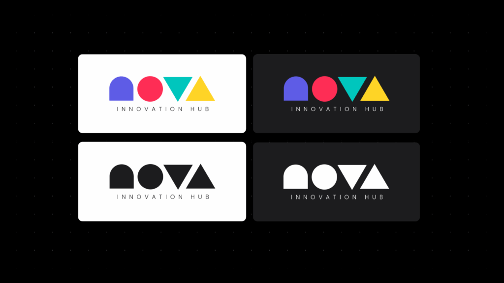
Two logo versions were created:
Minimum size guidelines ensure optimal legibility across mediums.
2. Color System
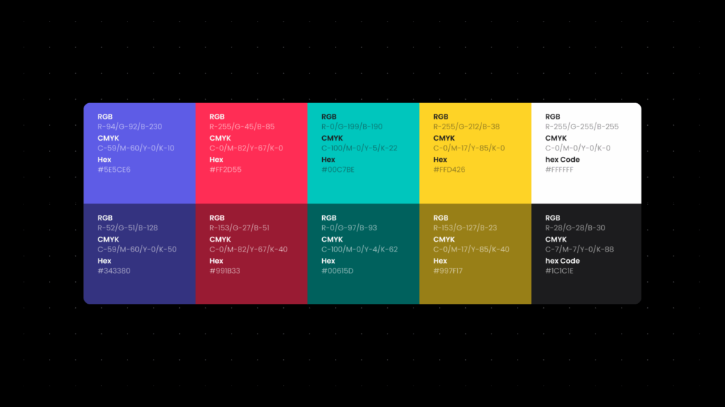
The chromatic palette was designed to reflect NOVA’s conceptual pillars. Each color carries intentional meaning, as described in the manual’s Color System section:
Dark tones support more neutral compositions, while the primary black (#1C1C1E) serves as a strong foundational background.
3. Typography
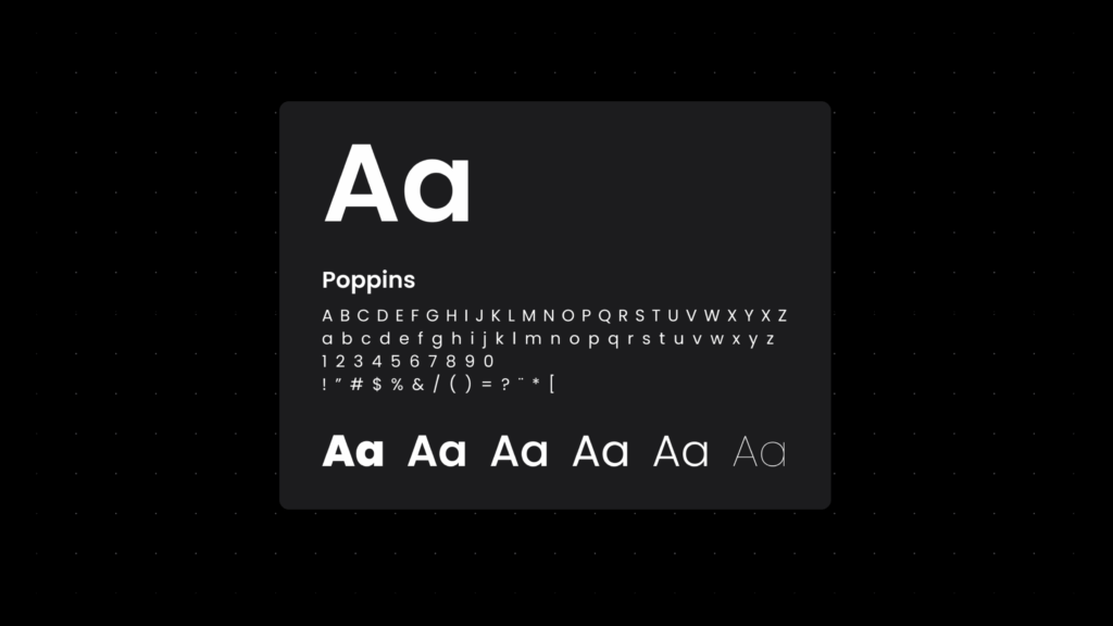
The chosen typeface, Poppins, reinforces the brand’s geometric and modern personality.
It supports:
The manual outlines the typographic hierarchy and usage rules.
4. Geometric Elements as a Visual Language
One of NOVA’s most distinctive elements is its geometric system, shapes used not only to build the logo but also as expressive graphic components throughout the brand.
These shapes:
5. Iconography
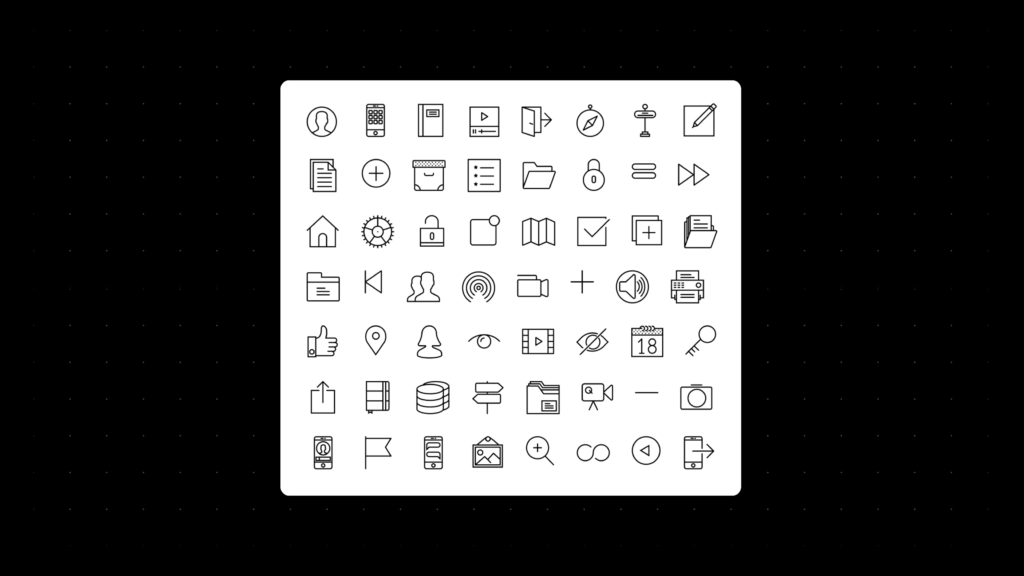
The icon set uses simple, linear strokes that align seamlessly with the brand’s geometry and typography.
This style ensures clarity, accessibility, and consistency, especially in digital applications.
6. Photography Guidelines
The photographic style is intentionally:
The manual advises avoiding overly corporate or static images, instead prioritizing authenticity, diversity, and movement.
Outcome
The final NOVA identity includes:
These elements form a unified brand ecosystem documented in the NOVA Identity Manual.
Impact
1. Unified brand expression
NOVA now has a recognizable and cohesive visual identity.
2. Clear Implementation Guidelines
Teams, partners, and collaborators can apply the brand correctly and consistently.
3. Strong Positioning for an Innovation Hub
The identity communicates ambition, creativity, and forward movement.
4. Scalable Design System
The brand is ready to expand into new programs, environments, and visual applications.
Reflection
This project embodies my approach as a designer:
NOVA’s identity is more than a logo; it is a modular visual system built to evolve.
Designing it from the ground up allowed me to explore branding, storytelling, conceptual thinking, and systematic design holistically.