PROJECT SNAPSHOT
FULL CASE STUDY
Overview
When I joined Clockwork, all product designs lived inside a single Sketch file: one massive prototype with no components, no structure, and no ability to scale. Colors were inconsistent, there were no defined grids, no typography rules, no icons, and no reusable patterns. Every new feature required rebuilding UI from scratch, leading to inconsistencies, inefficiencies, and confusion across the team.
One of my first initiatives was to migrate the entire product to Figma and build a comprehensive Design System that could truly scale with our roadmap. This became the foundation for Clockwork’s product experience over the following years, powering consistency, accessibility, maintainability, and collaboration among designers, developers, and stakeholders.
Problem
Before the Design System:
This environment made scaling the product extremely difficult.
My Role
I was the sole creator and architect of the Clockwork Design System, leading the full migration from Sketch to Figma and establishing the foundational elements of the product’s visual language, including colors, typography, grids, spacing, and iconography.
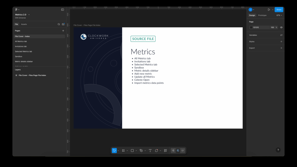
I built the complete component library (from simple primitives to complex modular patterns), defined the structure, documentation, and naming conventions, and designed the file organization model with index covers to improve navigation. Additionally, I implemented a review workflow to ensure visual consistency, usability, and accessibility across all product teams, while collaborating closely with engineering to standardize implementation and create a scalable, maintainable design ecosystem.
Objectives
Process
1. Migrating from Sketch to Figma
The first critical step was moving the entire product out of the monolithic Sketch file and into Figma. This allowed us to unlock:
I reorganized every screen, grouped features into separate files, and established a clean file hierarchy that matched our product architecture.
2. Creating a Clear Foundation (Core System)
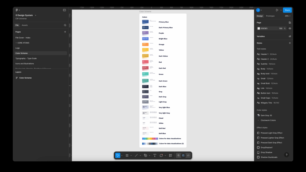
Color System with Variables
I defined an entirely new palette:
All colors were built as Figma variables, enabling global updates and consistent usage across the product.
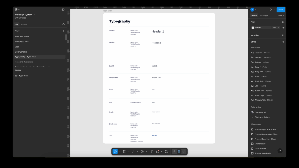
Typography Scale
I created a structured type scale that included:
Each style included rules for:
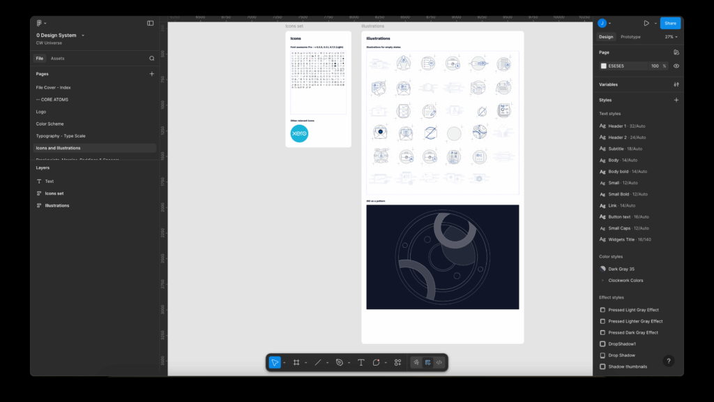
Iconography + Illustration Guidelines
I standardized icon sizes, stroke weights, and alignment to ensure unity across the entire interface.
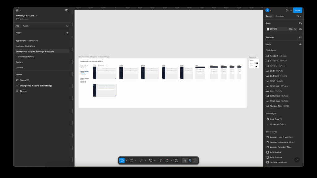
Grid, Breakpoints, and Spacing Tokens
This established the underlying rhythm of the UI.
3. Building the Component Library
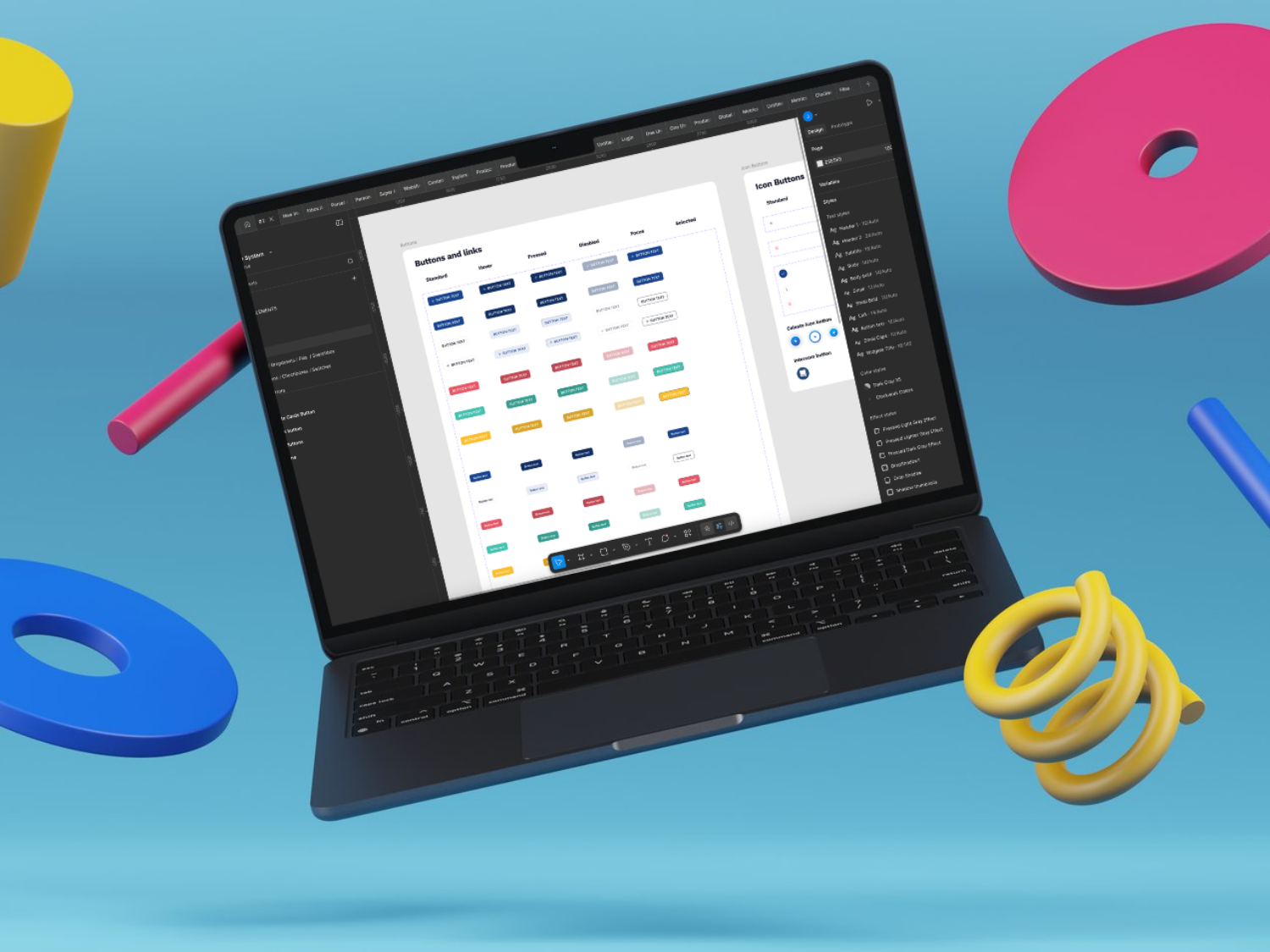
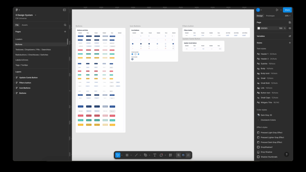
Simple Components
I built the base layer of reusable components:
Everything was created with:
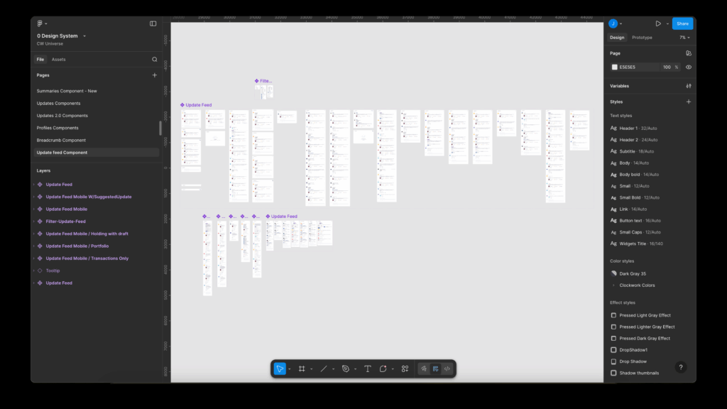
Complex Components
From the simple components, I constructed more complex UI blocks:
This modular architecture allowed designers and developers to assemble features incredibly fast, while maintaining consistency.
4. File Structure & Documentation System
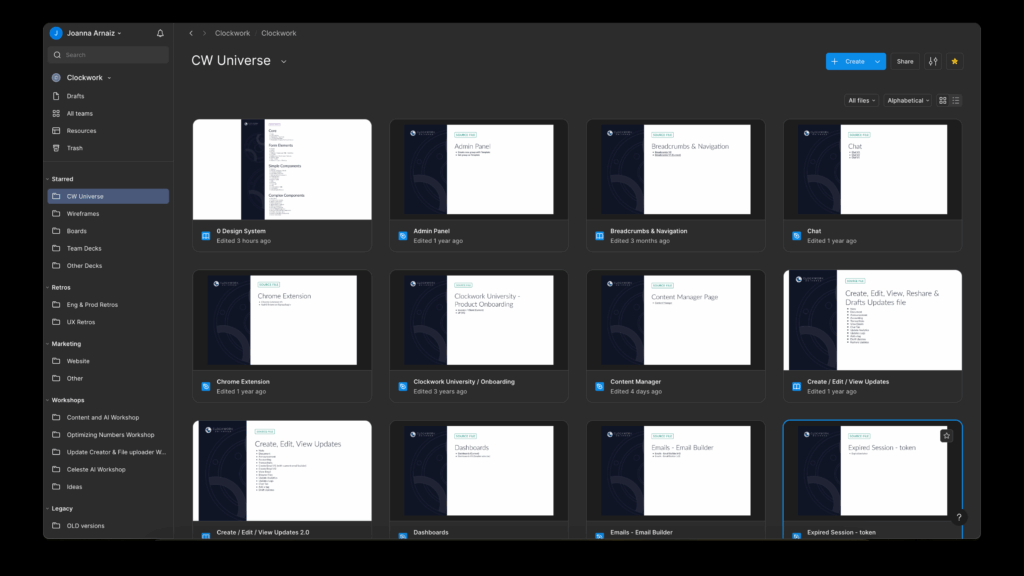
To ensure clarity and discoverability, I designed:
Custom File Covers + Index Pages
This dramatically improved team navigation and onboarding.
Separation Into Feature-Specific Files
Instead of having everything in one place, I reorganized the product into independent files:
Each file consumes the Design System library. When a component is updated at the DS level, it automatically propagates into all product files.
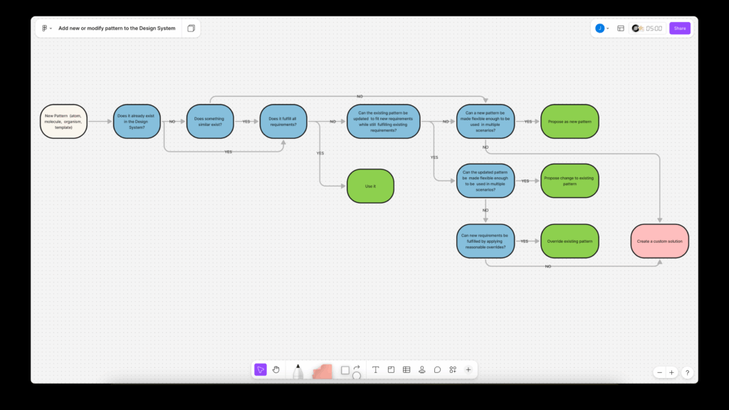
5. Review & Governance Workflow
To maintain quality, I implemented a design review process:
This turned the Design System into a living, evolving product.
Impact
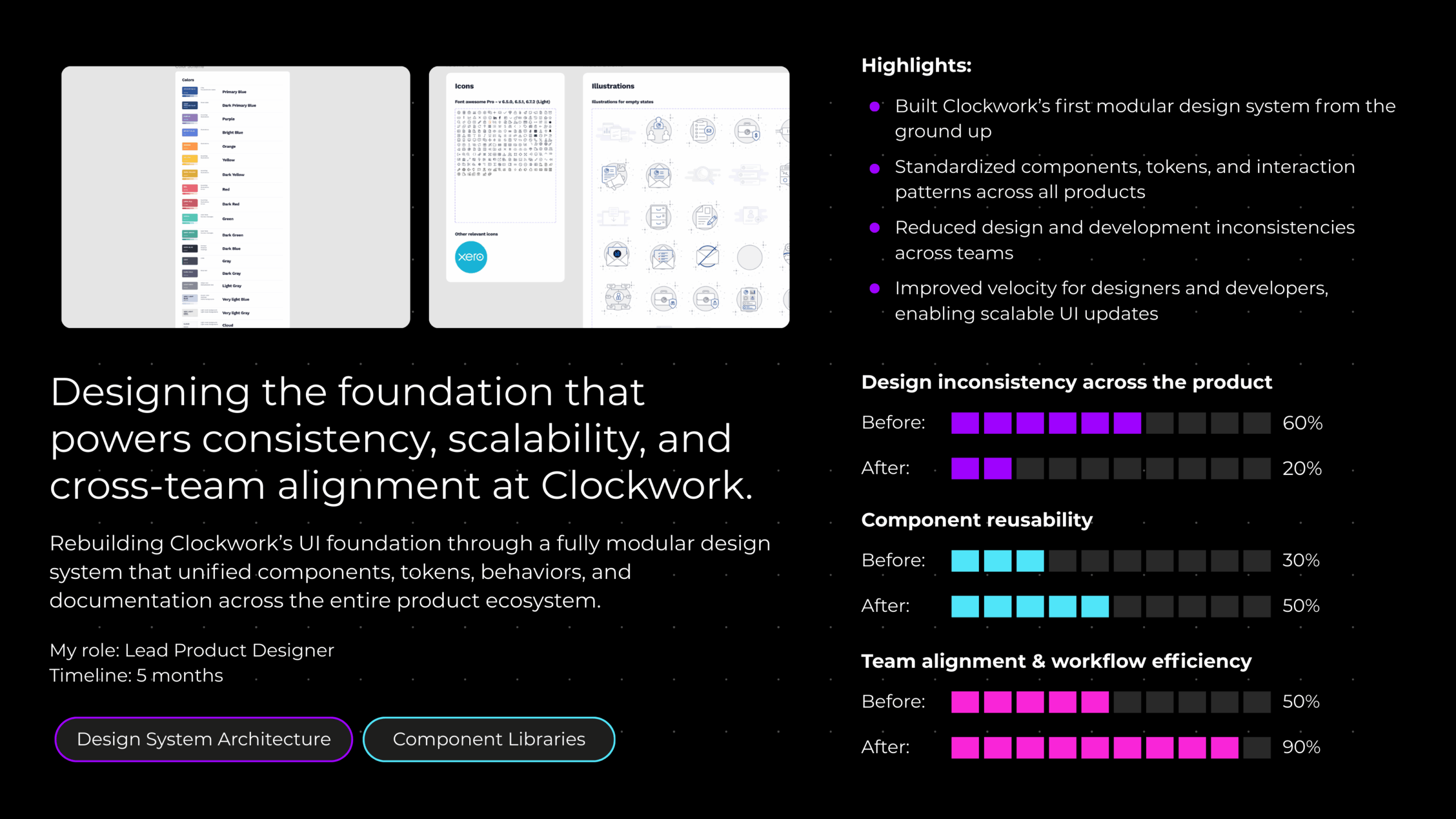
Over several years, the system proved to be a major success:
The Design System became one of the core pillars enabling Clockwork to grow its product ecosystem without losing coherence.
Conclusion
This initiative transformed a fragmented, unscalable UI into a unified design language and modular component architecture. By building the Design System from the ground up, including foundations, components, documentation, and governance. I enabled the team to deliver features faster, with higher quality, and with long-term scalability.
The Clockwork Design System remains one of the strongest infrastructure pieces supporting the product today.