Designing scalable digital products, design systems & AI-powered experiences for complex platforms
Hi, I'm Joi, a product designer from Montevideo, Uruguay, focused on designing scalable digital products, systems, and AI-powered experiences. For the past 15+ years, I've worked across product strategy, UX, interaction design, and visual systems, helping teams turn complex workflows into intuitive, human-centered products.
Recently, I've been exploring AI as part of the creative and product development process, experimenting with tools like Cursor and Claude to prototype ideas, rethink workflows, and build faster in more collaborative ways. I enjoy working where systems thinking, emerging technology, and creativity intersect. I'm also the co-creator of UX United, a course that helps cross-functional teams better understand UX and build stronger collaboration between design, product, QA, and engineering.
Mobile UX Strategy: How to Build Successful Products
UX Design for Augmented Reality
How to Design for Augmented and Virtual Reality
How to Create Intuitive Products by Imitating Physicality
Get Your Product Used: Adoption and Appropriation
Information Visualization
Mobile UI Design
The Ultimate Guide to Visual Perception and Design
Dynamic User Experience: Design and Usability
Creativity: Methods to Design Better Products and Services
Service Design: How to Design Integrated Service Experiences
Affordances: Designing Intuitive User Interfaces
Data-Driven Design: Quantitative Research for UX
AI for Designers
Perception and Memory in HCI and UX
Gestalt Psychology and Web Design
Visual Design: The Ultimate Guide
User Experience: The Beginner’s Guide
Liberating Structures
2024 · ProyectaT · Facilitation, Scrum Master
The One-Person UX Team,
Persuasive and Emotional Design
2019 · Nielsen Norman Group
Medieval Capital Letters
2019 · Caja Baja
Design Thinking and LEGO® Serious Play®
2019 · Miss Hack
Associate Degree, Web Design
2014 · ORT University
Associate Degree, Graphic Design
2013 · ORT University
Team management
I lead product design teams by creating clarity in the parts of work that often become messy as teams grow: expectations, feedback, collaboration, and career progression. Over time, I found myself doing more than shipping product experiences. I was also helping shape how designers worked together, how decisions were made, and how growth could feel more consistent and fair across the team. This section is a look into that work, from the mindset I bring to leadership to the career framework I built as the design team scaled.
Leadership approach
How I lead
Clarity
When the same questions keep coming up (what good work looks like, how feedback works, what growth means), I see it as a signal. I like turning ambiguity into shared understanding people can actually use.
Trust
I care about building processes that make work clearer, collaboration easier, and growth feel more consistent. Good systems should support teams, not slow them down.
Balance
Strong teams need both structure and flexibility. Clear expectations matter, but so does making space for different strengths, personalities, and ways of working.
Iteration
I don’t see frameworks as fixed. Like product design, team systems improve through feedback, real use, and continuous refinement alongside the people using them.
Featured case study
Agile growth system for product design
Problem
As the design team scaled, progression felt subjective. Designers asked what “good” looked like at their level, how they were evaluated, and what separated Mid from Senior, but answers varied by manager. Reviews lacked a shared rubric, and hiring levels were inconsistent.
Solution
I led the end-to-end creation of a Product Design Career Path and Performance Evaluation System: role levels, competency pillars, promotion criteria, and evaluation templates, aligned with product planning rhythms and cross-functional expectations.
Outcome
The team gained a shared language for growth, fair biannual reviews, and clearer hiring. Design professionalized alongside Product & Engineering, with transparency, feedback loops, and continuous improvement built into how we work.
I framed competencies the way agile teams frame quality: visible expectations, measurable behaviors, and room for different strengths within the same level.
I surfaced recurring questions from designers and inconsistencies across managers, then aligned with Engineering leadership and the CTO on why a shared framework was needed for scale, retention, and hiring.
2
Framework design
I defined four job levels with clear scope, autonomy, and impact expectations, mapped across competency pillars so “Senior” meant observable behaviors, not intuition.
3
Evaluation system
I built structured review templates: competency grids, level-specific behaviors, qualitative and quantitative indicators, and a consistent scoring model for biannual cycles, promotions, and mentorship.
4
Rollout & enablement
I delivered official job-level documentation for product designers, trained managers on the rubric, and onboarded new designers with the same clarity from day one.
5
Iterate the system
Like any agile practice, the framework improved through use. Feedback from review cycles informed refinements so the system stayed fair, practical, and aligned with how the product org actually worked.
I had the privilege of working for two and a half years in the team led by Joi, and I can confidently say that she is an exceptional leader. She has an outstanding ability to lead processes and teams, always maintaining a professional, clear, and organized focus… Joi also has a unique ability to lift the team’s spirits, always offering words of affirmation that motivate and foster a positive work environment.
Agile leadership
I lead design teams with the same mindset I bring to complex products: iterate in the open, align early, and make progress visible. Agile leadership is not only sprint planning. It is building lightweight systems so designers, product managers, and engineers share clarity on priorities, quality, and how work actually flows.
In a scaling product organization, I introduced a UX operating rhythm: team rituals, a structured workflow, centralized documentation, and facilitation practices that keep retros useful and decisions user-informed.
Project 01
Agile UX operating rhythm
Problem
As multiple feature projects evolved in parallel, the design team lacked a shared rhythm: unclear task stages, scattered documentation, and inconsistent ceremonies made it difficult to align priorities, protect focus, and collaborate effectively with PMs and engineers.
Solution
To bring consistency and clarity to the design process, I introduced a scalable UX operating model, including team rituals, a structured 8-stage workflow, centralized documentation, shared system references, that improved collaboration and decision-making across design, PM, and engineering.
Outcome
The team gained a more predictable rhythm, clearer visibility across ongoing work, and a shared approach to research, reviews, and usability testing, helping teams make more confident, user-informed product decisions.
How we built it
1
Team rituals & planning
I introduced lightweight weekly rituals (planning sessions, task reviews, and monthly retrospectives), creating a predictable rhythm that helped the team stay aligned, protect focus, and surface blockers early. I also rotate facilitation formats so retros stay useful, not repetitive.
2
Shared workflow & delivery visibility
I designed an 8-stage UX workflow and connected it to shared Notion boards for tasks, projects, and sprint planning, giving the team a clearer view of priorities, progress, and ownership.
3
Principles & system documentation
I documented a set of product principles and collaborative workflows for Figma, research, and design-system contributions, helping designers work more consistently and onboard faster.
4
Reviews & usability testing
We introduced regular product reviews and structured usability testing across live product flows, creating a stronger feedback loop between design, PMs, engineers, and users.
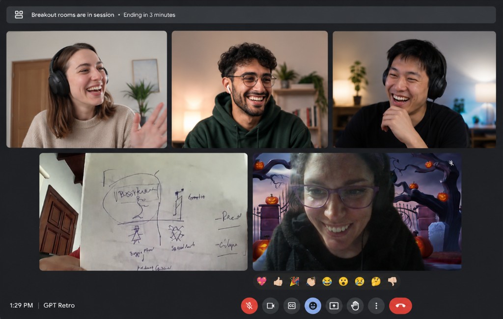
Facilitation in practice
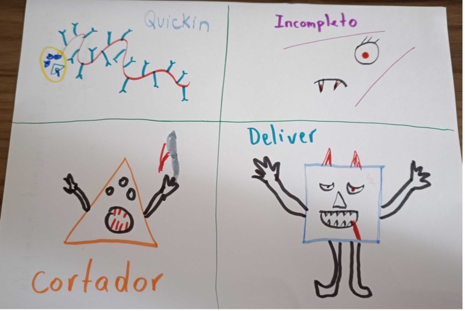
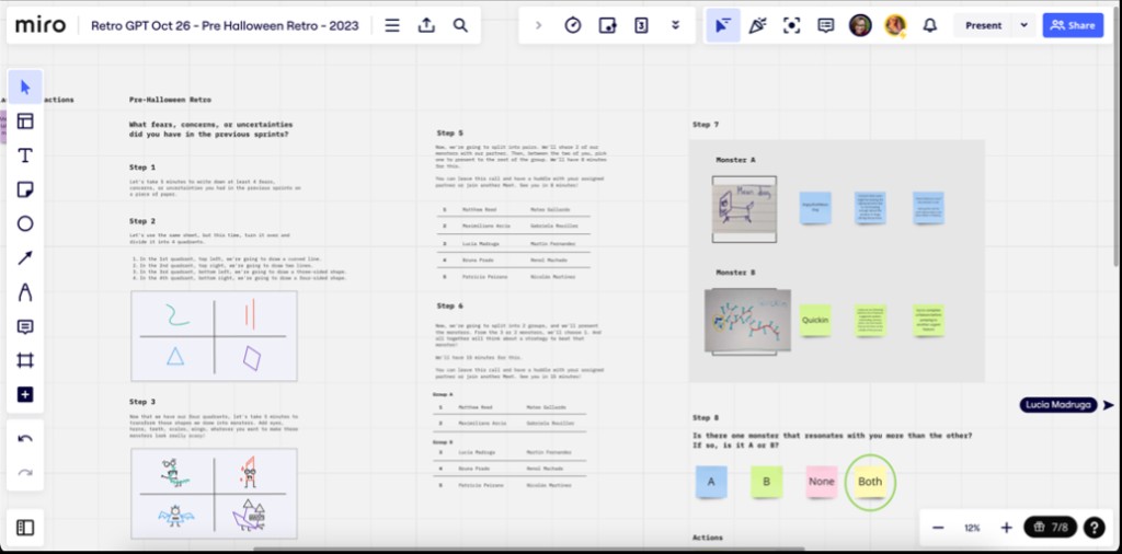
Standard retros weren’t always surfacing the fears and friction people carried between sprints. I facilitated a session using Tiny Demons, a Liberating Structure that turns concerns into named characters, making it easier to discuss what was hard without blame. The team mapped sprint worries, drew their demons in breakout rooms, and left with clearer language for blockers we’d been avoiding.
Remote breakout: sharing demons on cameraTeam drawings: naming what was getting in the waySession detail: monsters, stories, and next steps
Project 02
Current practice: Agile + AI
Problem
As our team processes became more structured, the challenge was no longer how to organize the work, but how to introduce AI in ways that were actually useful. We wanted to avoid adding unnecessary complexity or turning existing ceremonies into AI-heavy workflows that distracted from real collaboration.
Solution
Instead of building entirely new processes around AI, I integrated it into workflows the team already trusted. I used it to reduce repetitive work, surface patterns faster, and support decision-making during planning, retrospectives, documentation, and discovery. Human judgment always stayed with the team. AI simply helped us spend less time managing information and more time discussing what mattered.
Outcome
The result was a workflow that stayed lightweight and collaborative while becoming easier to maintain at scale. Planning became more focused, async communication clearer, and discovery insights easier to connect back to delivery work without adding overhead to the team.
How we applied it
1
Sprint visibility
Before planning sessions, I generated lightweight summaries of blocked tasks, recurring bottlenecks, and workload patterns from our Notion boards. This helped the team align faster on priorities and spend less time interpreting project status manually.
2
Faster documentation
I used AI to help with the heavier documentation side of product work: drafting feature specs, organizing epics, writing tickets, and structuring requirements before team discussions. It helped reduce repetitive work and made it easier to keep projects documented without turning documentation itself into a bottleneck.
3
Research synthesis
I used AI to organize and connect insights across usability tests, interviews, meeting notes, and sprint discussions. This made it easier to keep user context visible throughout delivery instead of treating discovery as a separate phase.
4
Async collaboration
AI also helped summarize long discussions, organize scattered information, and make async updates easier to consume across time zones and disciplines, reducing the amount of coordination overhead required from the team.
AI-driven design
I’ve been using AI to improve how I design, organize, and analyze information for roughly four years, long before it became part of every product conversation. What started as small experiments in research synthesis has grown into a practical layer across my work.
For me, AI works best when it reduces repetitive cognitive load so I can spend more time on judgment, collaboration, and craft. These are three areas where that shows up most clearly in my day-to-day practice.
Project 01
Research synthesis with Dovetail
Problem
User research produces rich qualitative data, but synthesizing interviews, tagging findings, and spotting patterns across studies takes time. Important connections can stay hidden when insights live in separate notes or decks.
Solution
For years I’ve used Dovetail as my research hub: upload interviews, generate transcripts, highlight findings, build insight boards, and maintain persona profiles. On top of that, I use custom AI agents to cross-reference studies and surface connections I might not catch reading one interview at a time.
Outcome
Research becomes easier to analyze, organize, and share. The team gets clearer insight boards, stronger persona work, and synthesis that goes deeper than manual tagging alone.
How I use it
1
Capture & transcribe
I upload user interview recordings to Dovetail. The platform generates a transcript of each conversation, which becomes the working base for analysis instead of starting from scattered notes.
2
Tag findings & build boards
Inside each interview I mark key moments, tag findings, and cluster themes. Dovetail lets me connect insights into boards and keep persona profiles updated as research evolves.
3
Cross-study analysis with agents
Beyond Dovetail’s built-in tools, I use custom agents to compare interviews, personas, and past findings. That helps me cross information in ways I might not have thought to do manually, and surface insights that are easy to miss at first read.
4
Share organized insight
The goal is research the team can actually use: insight boards, tagged evidence, and synthesis that supports planning, design decisions, and stakeholder conversations without losing the original context.
Project 02
Design system handoff to Storybook
Problem
Even with a strong Figma design system, developers still need a reliable coded reference. Static specs and screenshots don’t always translate into components they can inspect, test, and implement with confidence.
Solution
I connect our Figma library to Storybook through Claude Code, using AI to help bridge design tokens, component structure, and documentation so engineering gets a living catalog aligned with design.
Outcome
Handoff gets clearer and more consistent. Design and engineering share a common language through components that exist in both Figma and code, with less back-and-forth during implementation.
How it works
1
Figma as the design source of truth
Our components, variants, and tokens live in a shared Figma library. This is where design defines how the UI should look and behave before anything gets built.
2
Claude Code as the bridge
Claude Code is an AI coding agent that can work inside the codebase. I use it to read design system context from Figma and help generate or update component code, prop definitions, and documentation structure in a way that stays closer to the source design.
3
Storybook for developer handoff
Storybook is a component catalog for developers. Each component gets documented with its states, props, and usage examples so engineers can browse, test, and implement without guessing how design intended it to work.
4
A connected workflow
The flow is: design in Figma, translate structure and tokens with Claude Code, publish to Storybook. That closes the gap between what designers maintain and what developers ship, especially as the system scales.
Project 03
AI-assisted prototyping
Problem
Exploring multiple interaction models or layout directions traditionally takes significant setup time, which can limit how many alternatives the team evaluates before committing to a direction.
Solution
I combine Claude Code and Figma Make to prototype faster: generating flows, testing variations, and pressure-testing ideas before investing in full design polish.
Outcome
We explore more alternatives in less time, with prototypes strong enough to support real conversations about trade-offs, feasibility, and user experience early in the process.
How I use it
1
Explore in Figma Make
Figma Make helps me generate and iterate on UI directions quickly inside Figma. It’s useful for opening up alternatives when I want to compare layouts or interaction patterns without building everything from scratch.
2
Build working flows with Claude Code
When a direction looks promising, I use Claude Code to move into more functional prototypes: flows, states, and behavior that are harder to communicate with static screens alone.
3
Compare and decide with the team
The point isn’t speed for its own sake. It’s having enough options on the table, early enough, to make better product decisions together before the team invests in full build-out.
UX metrics
Good UX measurement starts with organizational goals, not with whatever is easiest to track. As NN/g recommends, metrics should show how experience work connects to outcomes the business actually cares about: conversion, retention, support load, and product adoption.
In the product I work on, we use FullStory to combine quantitative behavioral data with session replay. That lets us move from “something feels off” to evidence we can prioritize, design against, and validate after release.
Project 01
Measuring what matters
Problem
Teams often track satisfaction scores or page views that look healthy in a dashboard but do not explain why users struggle, where they drop off, or which design changes would improve the product. Without tying metrics to goals, UX data becomes noise.
Solution
I map UX metrics to product goals first: which flows matter for conversion, which tasks drive retention, and where friction creates support load. Then I choose a focused set of behavioral signals in FullStory that reflect real user struggle, not vanity numbers.
Outcome
Product conversations shift from opinion to evidence. Design, product, and engineering can align on what to fix, estimate impact, and replay sessions to understand context before changing the experience.
How I use metrics in decisions
1
Start from the goal
Define what success looks like for the flow or feature: complete a booking, finish onboarding, adopt a new capability. The metric should reflect that outcome, not a generic usability score collected out of habit.
2
Pair quant with replay
FullStory shows where users drop off or show frustration. Session replay explains why: confusing copy, a broken control, slow load time, or a layout that looks clickable but is not.
3
Prioritize by impact
I use FullStory Conversions to estimate which frustration signals correlate with lost completions, so the team fixes what affects the funnel most instead of chasing isolated clicks.
4
Validate after shipping
After a design change, I compare the same funnel and signals over time to confirm conversion, friction, and error rates moved in the right direction.
Project 02
Key metrics in FullStory
These are the metrics I return to most often. FullStory detects several automatically; others come from funnels and Conversions analysis built around product-critical paths.
Conversion
Funnel conversion rateStep drop-offMedian time to convert
Friction signals
Rage clicksDead clicksLost conversions
Errors & performance
Console errorsError clicksSlow page load
How to read them in FullStory
1
Funnel conversion rate
Build a funnel in FullStory for the flow you care about (e.g. start checkout → confirm payment). FullStory calculates:
Conversion rate = users who completed the funnel ÷ users who started the funnel
Review step-by-step drop-off and median time to convert to see which step is slow or losing the most users.
2
Rage clicks
FullStory logs a rage click when someone clicks or taps rapidly in the same area, usually a sign of frustration. Open the rage click report to see a rank-ordered list of elements, then watch sessions to understand what users expected to happen.
3
Dead clicks
A dead click is a click on something that looks interactive but does not respond. In Conversions, compare users who had dead clicks on a step vs. those who did not. FullStory surfaces conversion impact: the share of users with the signal who dropped out compared to users without it.
4
Console errors
Search for the Console Error event filter or build a Dimensionality card grouped by error text. This quantifies how many sessions hit the same JavaScript error and on which pages, then replay those sessions to show engineering exactly what broke in context.
5
Conversion impact & lost conversions
In FullStory Conversions, select a funnel and let the tool analyze frustration signals (rage clicks, dead clicks, network errors, slow pages). It ranks signals by estimated lost conversions so the team can ask: if we fix this element or step, how many more users might complete the flow?
6
Session replay as the proof layer
Metrics tell us where to look; replay tells us what to do. I share short clips with PM and engineering when a signal is ambiguous, so design decisions stay grounded in observed behavior rather than dashboard averages alone.
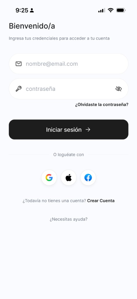
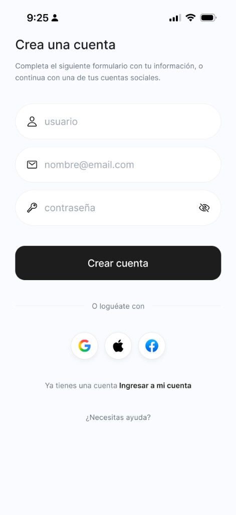
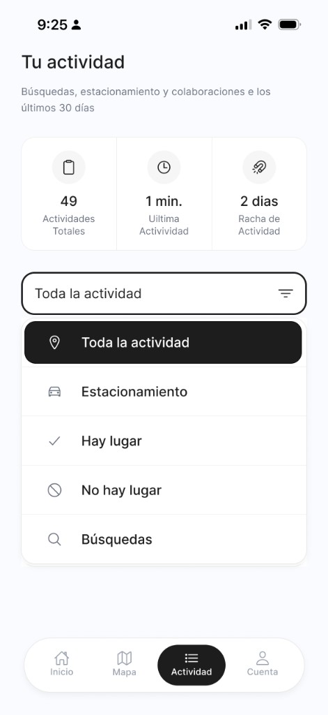
UX design sample
Case study
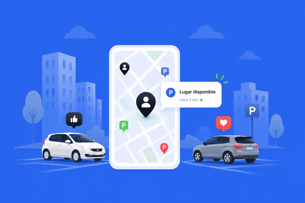
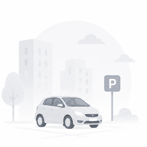
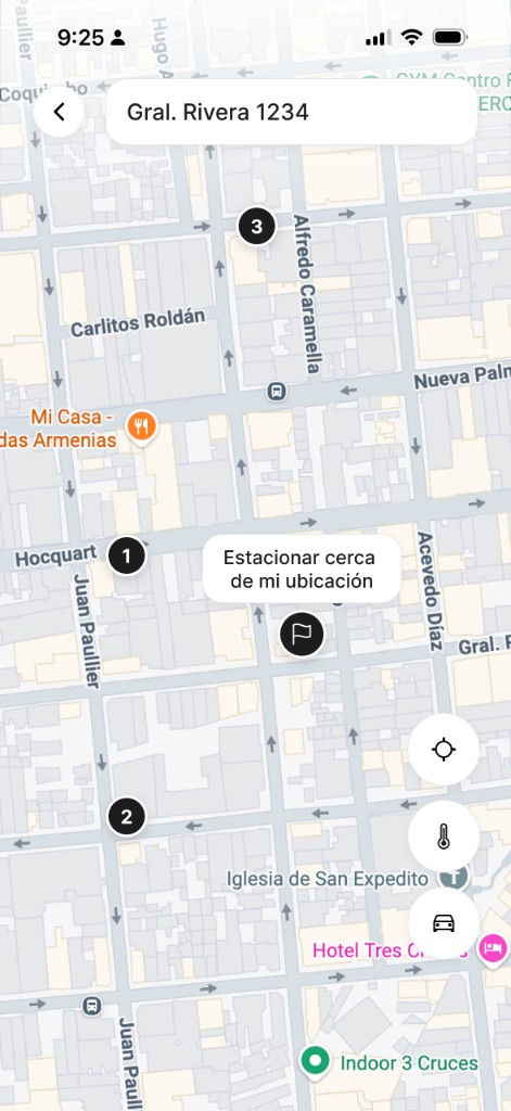
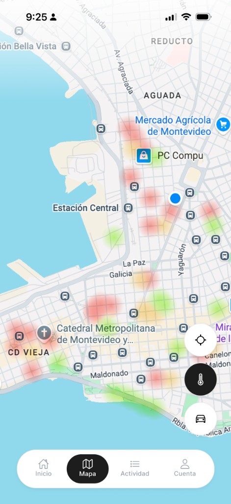
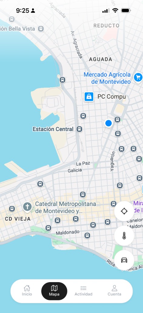
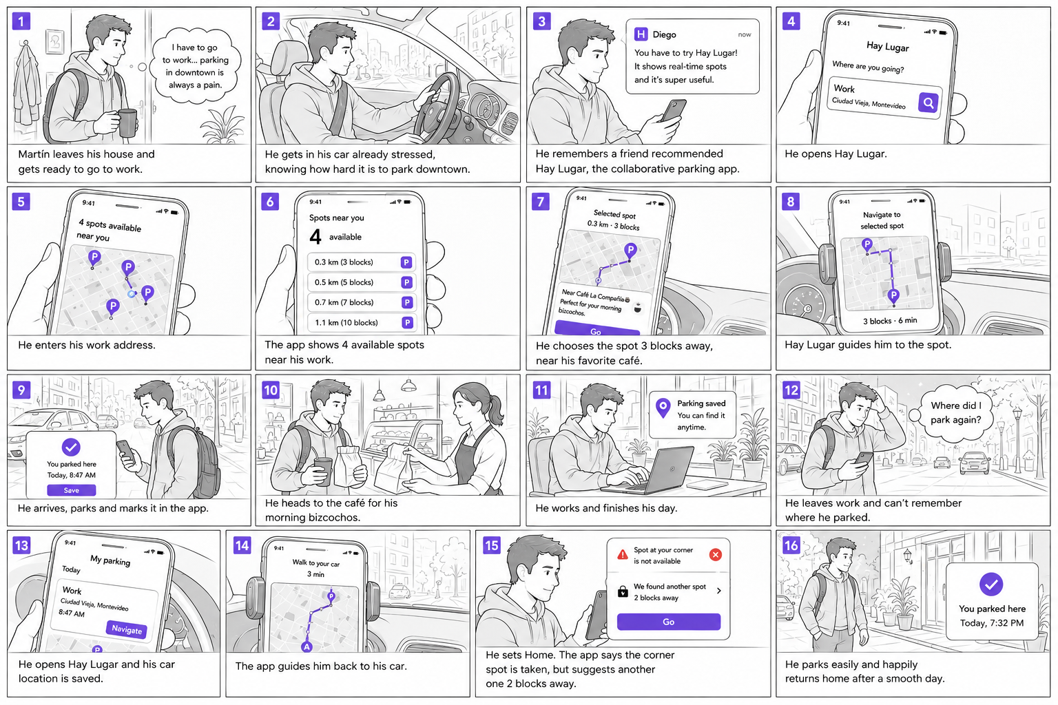
Collaborative parking availability app
Product
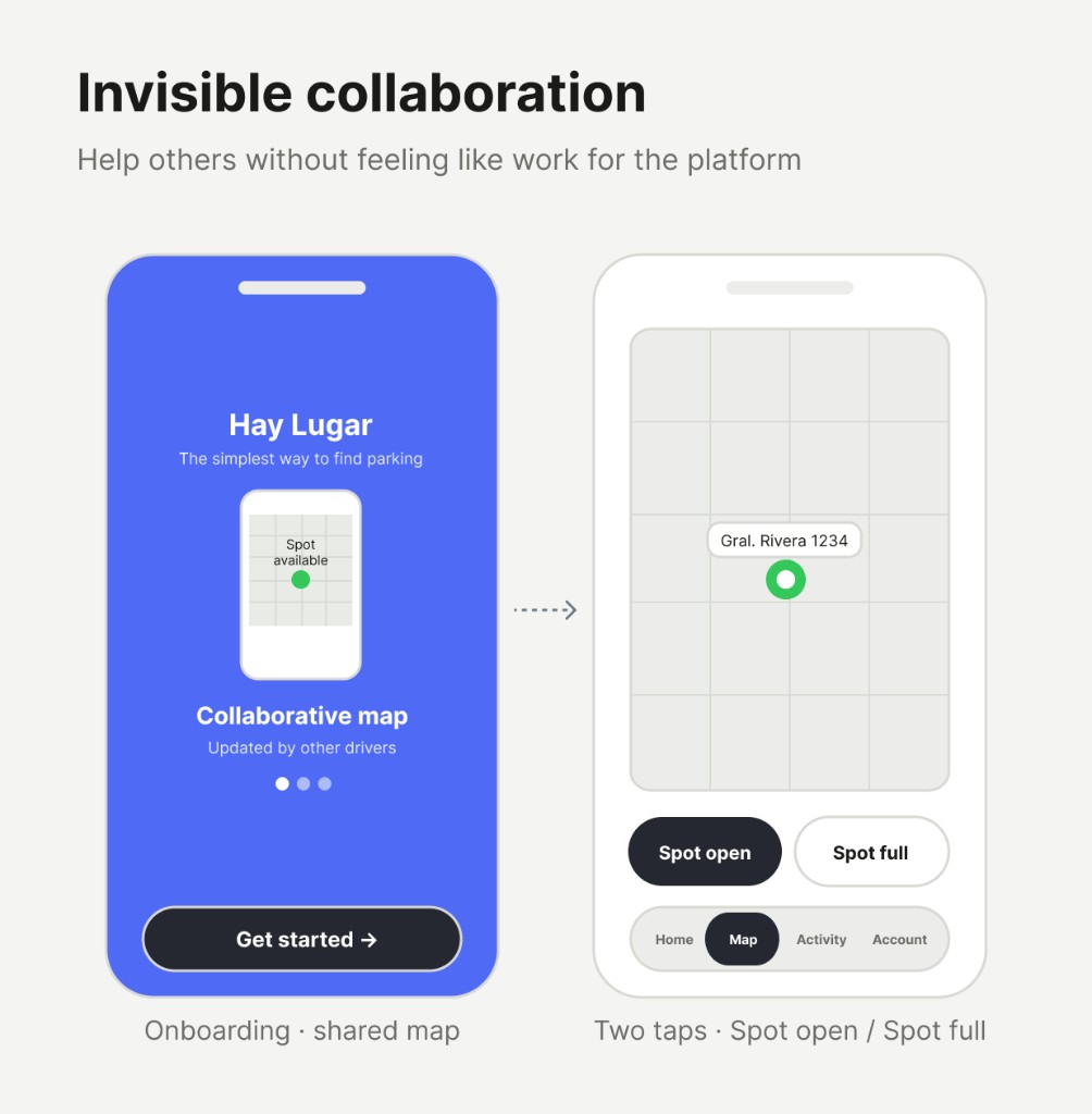
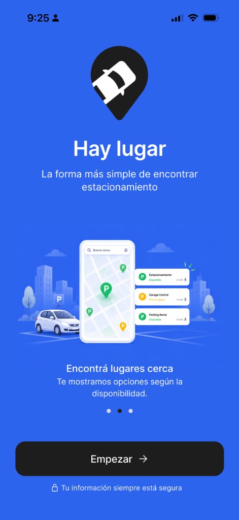
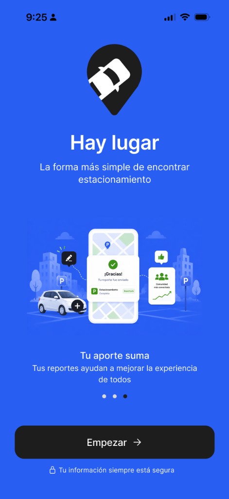
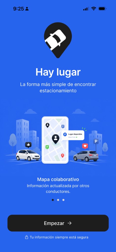
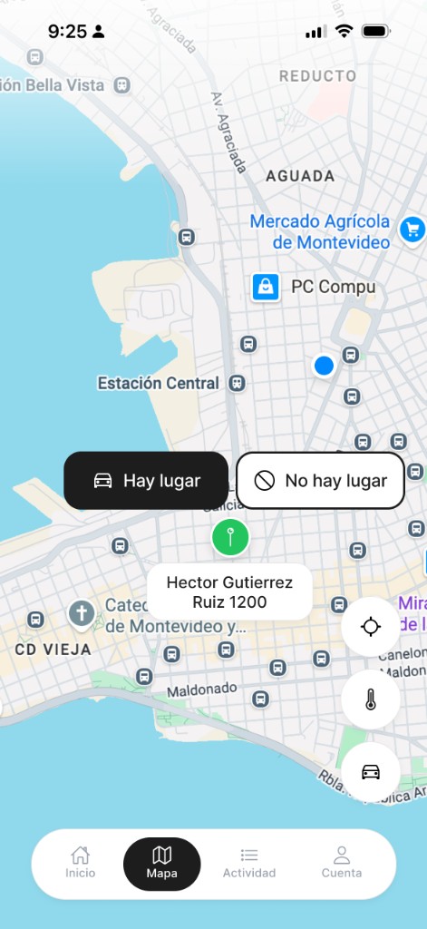
Hay Lugar — collaborative parking availability for urban drivers
Focus
Smart parking, real-time collaboration, and stress-free city driving.
Tools
Figma, prototyping, user flows, iterative testing
Problem & audience
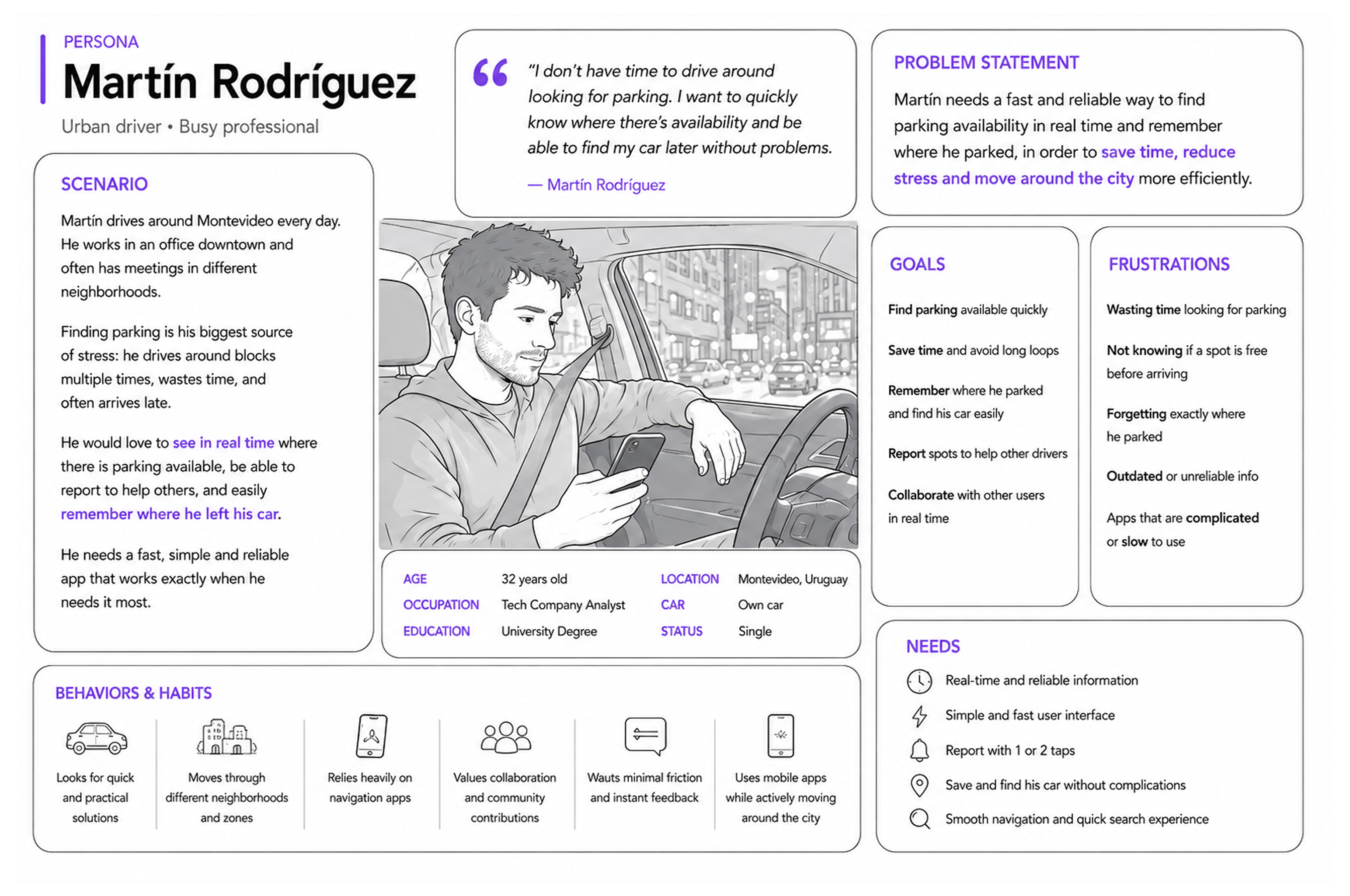
✓
Who am I designing for?
Urban drivers who move through dense cities like Montevideo: commuters, students, delivery workers, and professionals who park on the street often and need fast decisions while driving.
✓
What is their challenge?
Finding parking consumes time, creates stress, worsens traffic, and adds constant uncertainty. Most apps show static maps, lack real-time context, or ask for too much interaction when the user is already distracted behind the wheel.
✓
How can I solve it?
Build a collaborative layer where drivers share availability in seconds: report a spot, search nearby zones, save where they parked, and walk back to the car later. The goal is not just to show places, but to reduce anxiety and lost time.
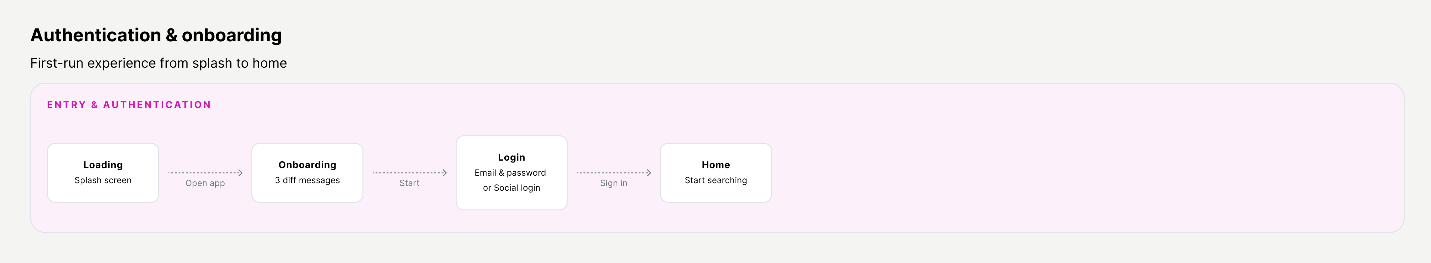
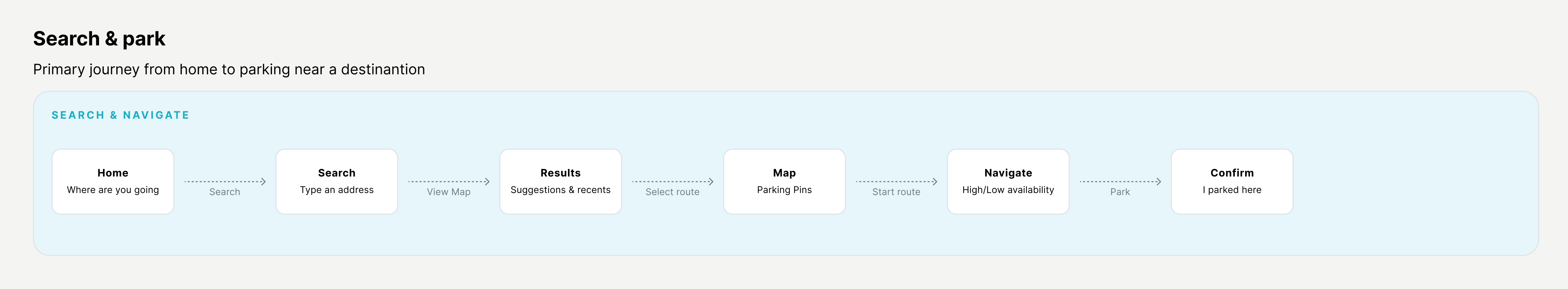
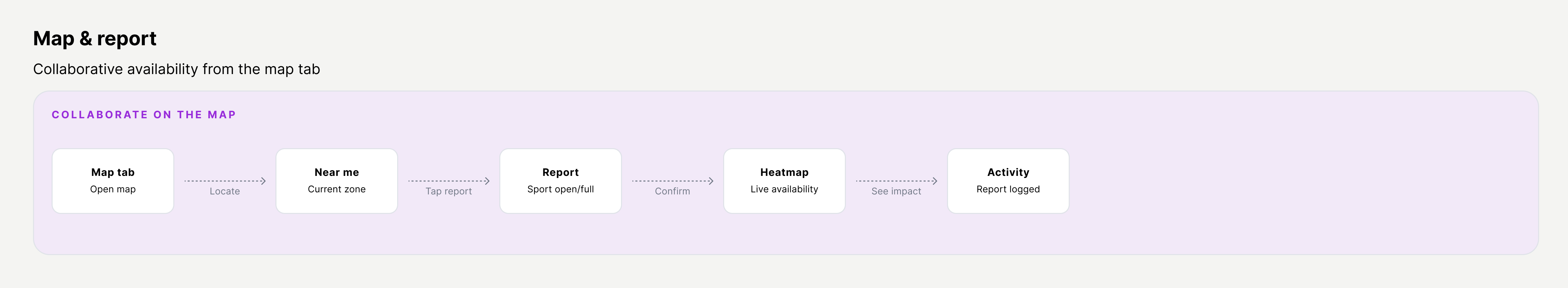
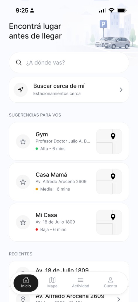
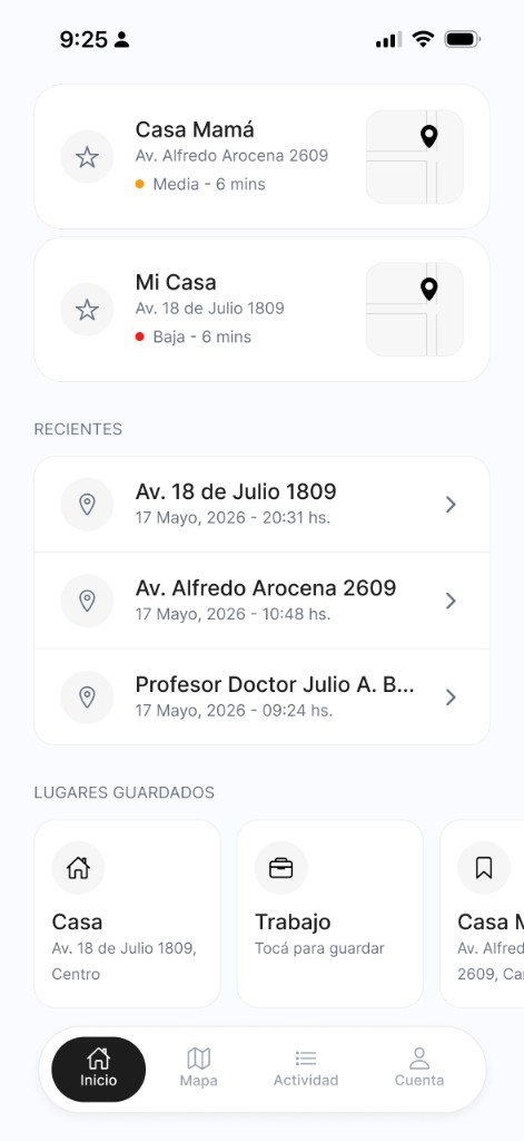
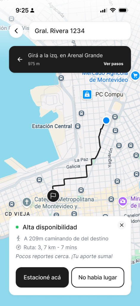
Planning the user flow
Core flows
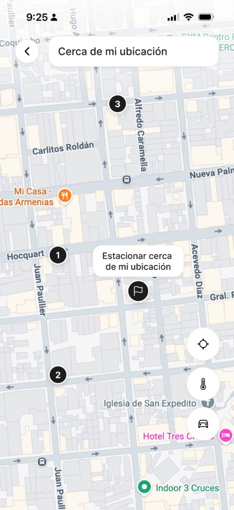
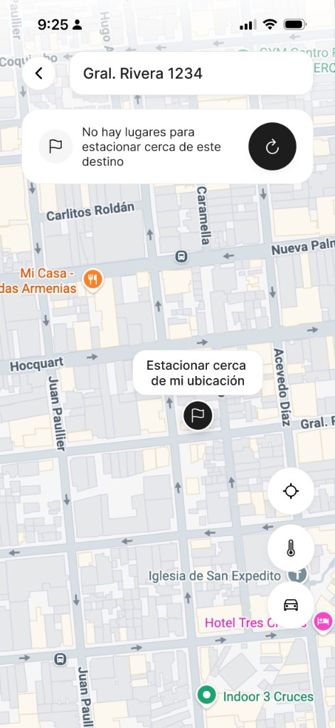
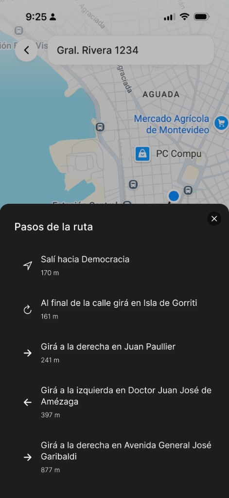
Map the four critical paths: report availability, search nearby zones, mark where you parked, and walk back to find your car. Each flow should answer one question in the moment.
Wireframes
Sketch a map-first mobile structure with few actions per screen, inspired by Uber, Waze, and Apple Maps: simple, fast, and readable at a glance.
Prototype
Build interactive flows in Figma to test how quickly users can report, search, or recover their car with one hand while simulating real driving context.
Design process
Hay Lugar was shaped as an iterative product: start from real urban driving context, prototype the fastest paths first, test them in motion-heavy scenarios, and refine until reporting or searching takes seconds, not minutes. The interface should almost disappear and leave only the feeling of arriving easier.
Context research
Frame the problem around dense-city parking: time lost, stress, forgotten locations, and why static maps fail when availability changes block by block.
Flow testing
Test prototypes in realistic conditions: one-handed use, quick glances, incomplete addresses, and decisions made while moving through the city.
Pattern synthesis
Compare against mobility products users already trust. Extract what works: clarity, speed, calm hierarchy, and context before technical precision.
Iterations
Remove friction, simplify actions, and validate that each screen answers exactly what the user needs in that moment.
UX principles in practice
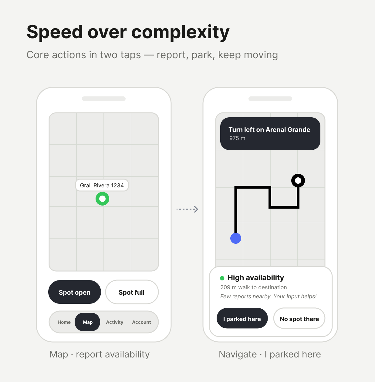
1
Speed over complexity: every core action (Spot open, I parked here, search nearby, find my car) should take only a few taps.
2
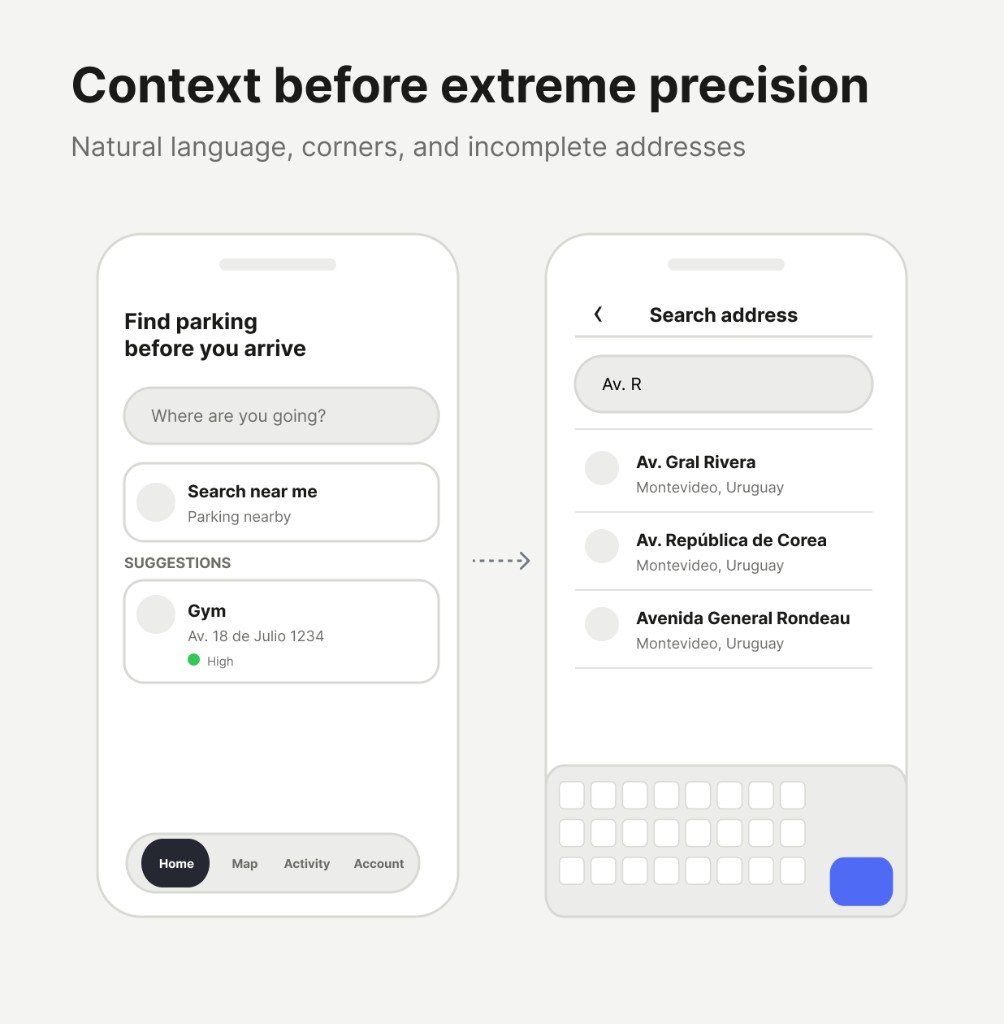
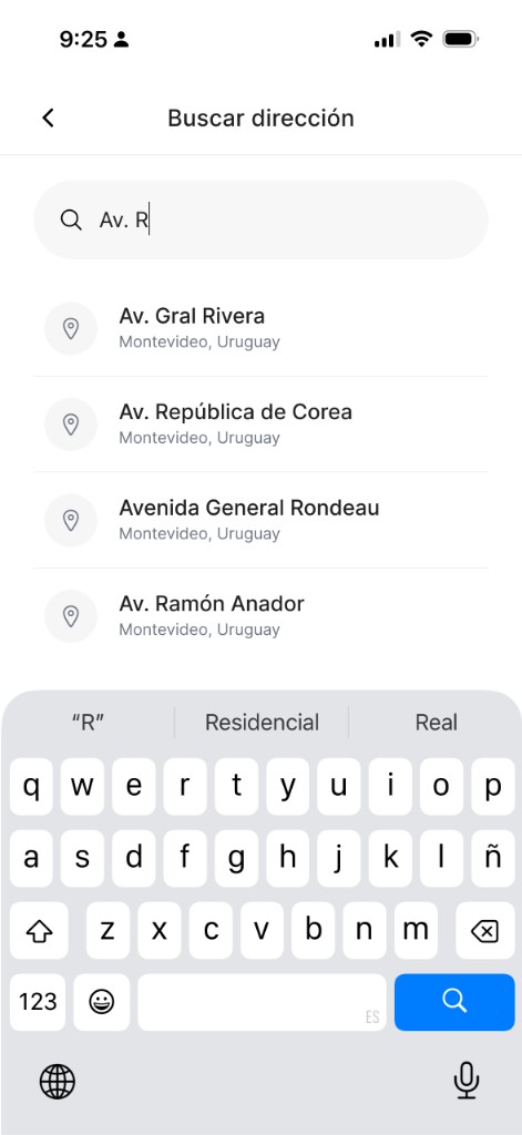
Context before extreme precision: support how people actually search — intersections, incomplete addresses, neighborhood names like Rivera y Soca or Centenario.
3
Invisible collaboration: reporting should feel effortless. Users help others without feeling like they are working for the platform.
Key UX decisions
1
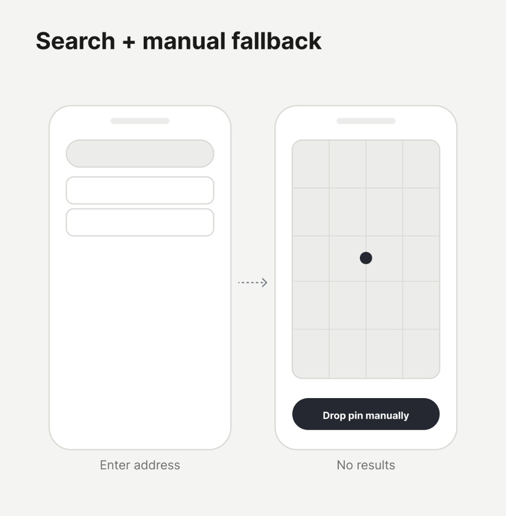
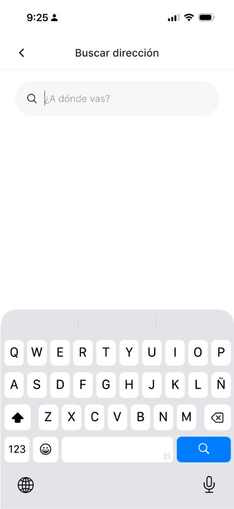
Improve autocomplete for streets, corners, known places, and natural language — with a manual pin fallback when search returns nothing.
2
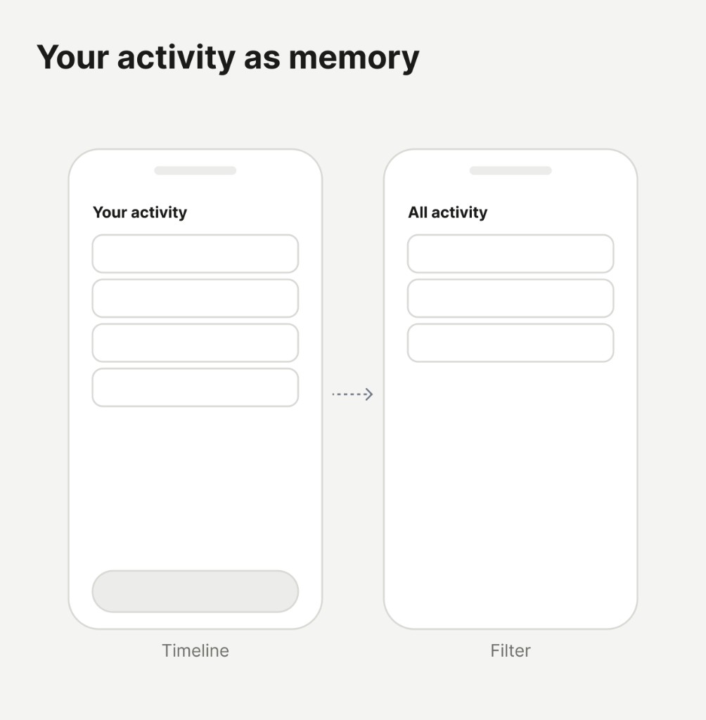
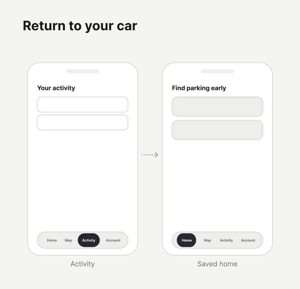
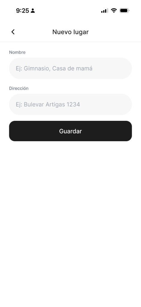
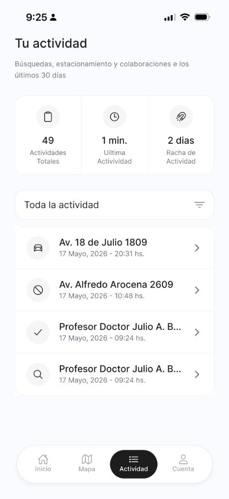
Turn Your activity into personal memory: searches, parked locations, reports, and quick return to the map — not just a technical log.
3
Design for real mobile use: thumbs, one hand, quick reading, and minimal color noise.
Important interaction decisions
1
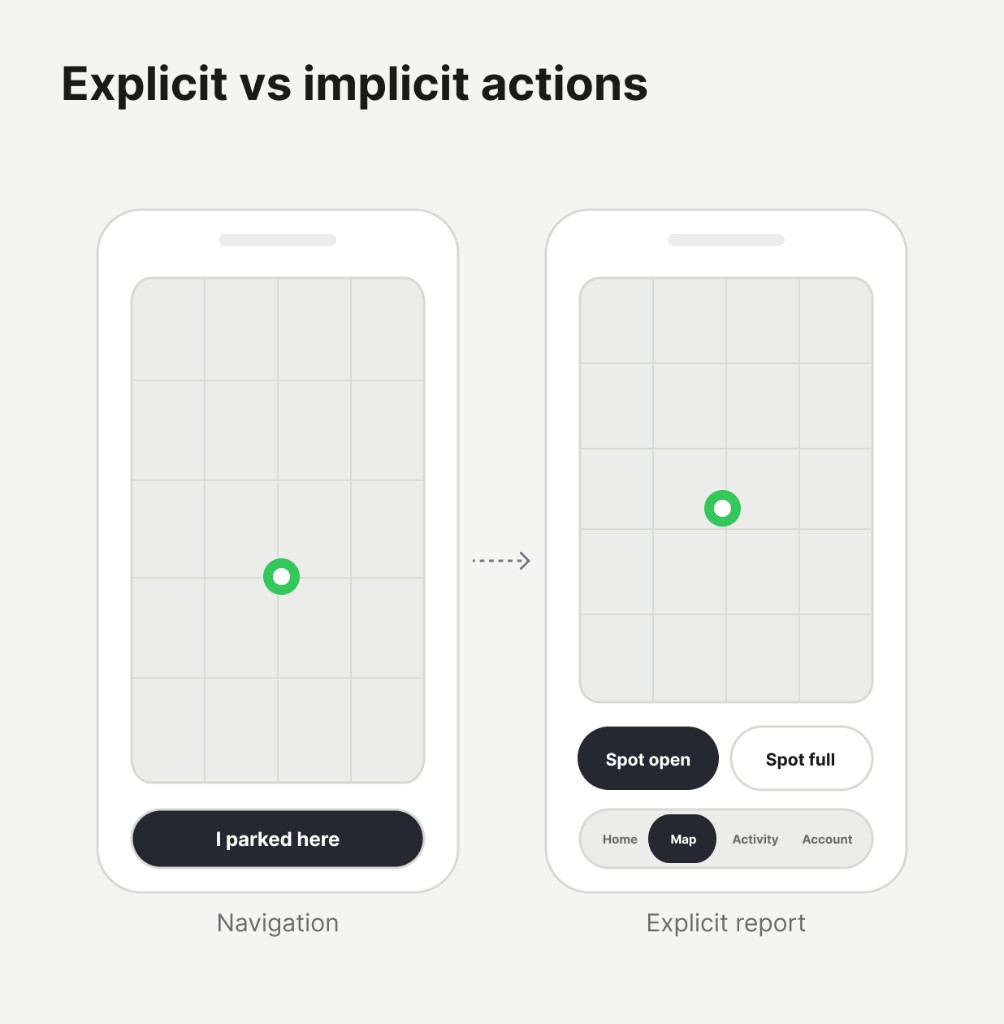
When users tap I parked here, the spot becomes occupied internally — but UX does not surface that as Spot full, because they did not explicitly report unavailability.
2
Find my car is emotional as much as functional: it reduces anxiety and gives users confidence they can return to their vehicle later.
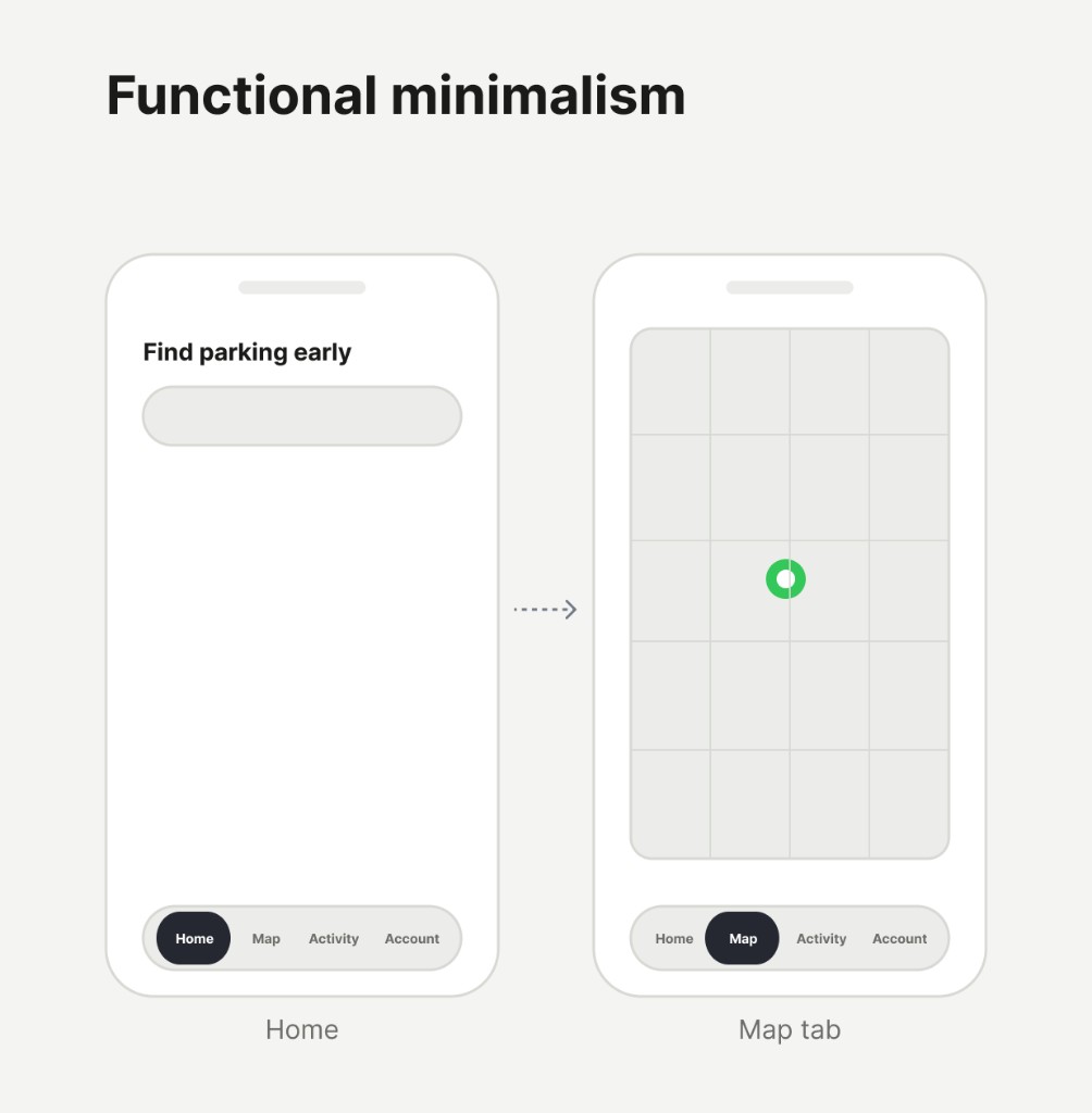
3
Remove empty buttons, long copy, and actions without real value. The app should feel light, fast, and immediately clear.
Visual design decisions
Hay Lugar
Calm visual system
Minimal surfaces, strong hierarchy, and functional color only where it carries meaning — parking, status, and wayfinding.
Parking nearby · few reportsInter Regular · 16pxBody
Av. 18 de Julio 1209Inter Regular · 14pxCaption
Helper or legal copyInter Regular · 12pxHelper
Icons
Ionicons (outline) · 24×24 · #212529 on light surfaces
Buttons
Search address or place
InicioBuscarViajesPerfil
Cards
GymProfesor Doctor Julio A. Bustamante 1234 Alta - 6 mins
CasaAv. 18 de Julio 1809, Centro
Av. 18 de Julio 120917 Mayo, 2026 - 20:31 hs.
Av. Alfredo Arocena 260917 Mayo, 2026 - 10:48 hs.
Profesor Doctor Julio A. Bustamante 123417 Mayo, 2026 - 09:24 hs.
Profesor Doctor Julio A. Bustamante 123417 Mayo, 2026 - 09:24 hs.
Border radius
2px
4px
8px
12px
16px
20px
40px
Shadow elevation
LowCards at rest
MediumFloating nav, dropdowns
HighSheets, modals
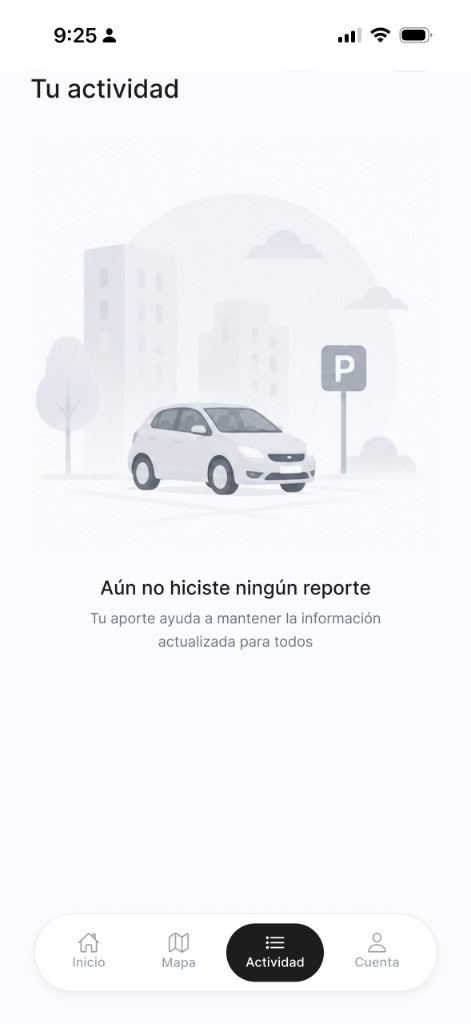
Illustrations
Map & markers
OnboardingEmpty state · Actividades
1
Onboarding screens use brand blue; empty states use flat neutrals
Current location Vehicle Parking
1
Use soft grays, white cards, minimal shadows, and strong typographic hierarchy based on location, action, and time — not aggressive color.
Key findings & highlights
✓
Less friction, more context
Each screen should answer what the user needs right now. Avoid long forms, deep navigation, and decisions that do not belong in a driving context.
✓
Collaboration should feel natural
Real-time availability works when reporting is faster than the problem it solves. The product wins when helping others takes almost no effort.
✓
Calm design builds trust in motion
A restrained visual system — light backgrounds, simple icons, generous spacing — keeps attention on the map and the next action, not on the interface itself.
✓
Mobile-first means real-world constraints
Design for fingers, one-handed use, quick scanning, and incomplete input. That is what makes Hay Lugar usable while moving through the city, not just on a desk.
Completed designs
Recommendations
What people say about working with me: feedback from teammates, leaders, and collaborators across product design.
“
I had the privilege of working for two and a half years in the UX/UI & Product Design team led by Joi, and I can confidently say that she is an exceptional leader. She has an outstanding ability to lead processes and teams, always maintaining a professional, clear, and organized focus that aligns with both user and team needs. What truly sets Joi apart is her remarkable clarity, creativity, and ability to make sound decisions, always grounded in thorough problem research and a deep understanding of the user. Additionally, her patience, dynamism, enthusiasm, and empathy make her an incredibly approachable person. Joi also has a unique ability to lift the team’s spirits, always offering words of affirmation and appreciation that motivate and foster a positive work environment. If you have Joi as a leader on your team, not only will your product stand out, but your team will work with energy, motivation, and a constant flow of innovative ideas. I highly recommend Joanna without hesitation.
“
Joi is a very talented design professional, with a keen eye for detail, who has consistently delivered the “goods” on every design project we worked on. She always has something refreshing to offer, forcing us to dream bigger. Joi is deeply passionate about her work; constantly looking to improve her skills as a UX professional. She truly understands how to design UIs meant for repeat use (for clarity), as opposed to simply chasing the “wow” factor. She is great at collaborating with others on design direction, and can easily come up with design alternatives to facilitate design critiques. To top it off, she has the technical savviness to implement her designs for our react-based web apps. I will not hesitate to work with her again!
“
Joi is an incredible product designer, researcher, and UX strategist. I don’t know many people with her level of work ethic and enormous curiosity, and she inspires me to always learn and grow as a designer. From her speaking engagements to her relationship with the design team, she is a thought leader in UX/UI. She helped transform our customer product into a true enterprise-level experience. Throw anything at Joi and she will conquer it.
“
Joanna is an incredibly versatile UX/UI designer. She is passionate about design and happily shares her knowledge with others, making her a great team player. She’s been working in design for a good number of years and is aware of how quickly this industry can change, so she anticipates changes in trends in design and web/app development. She’s experienced, hardworking, and a pleasure to work with. I can’t recommend her enough!
“
Joi is passionate about what she does, always pushing herself and making sure things are done right. She cares deeply about the quality of her and her team’s work. But she’s also fun and brings a great positive energy to the table. Over the years, she has consistently produced high quality visual design work while producing great creative ideas. I heard many people say that working with Joi was a good experience, a very rewarding one. Although we didn’t work much together, I can say Joi is someone you definitely want in your team.
Talks & courses
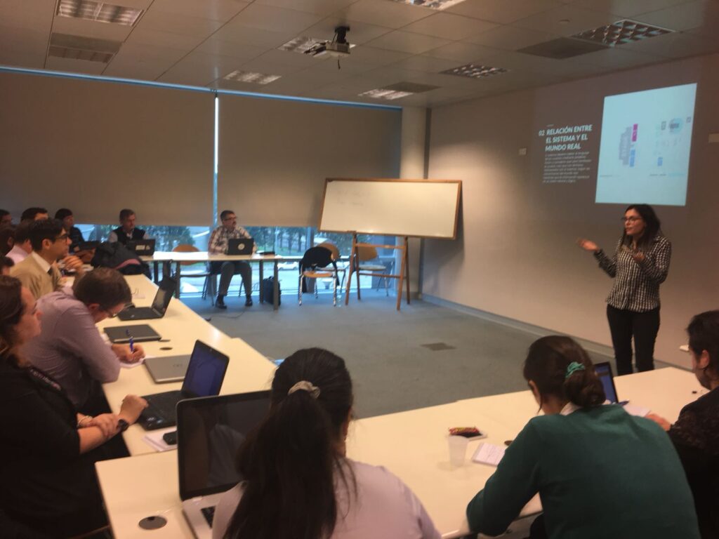
Over the years, I’ve shared my experience in UX, usability testing, design systems, and product thinking through courses, workshops, and conference talks across Latin America. I enjoy teaching teams how to elevate their design maturity, collaborate better, and apply user-centered methods in real product environments.
Conference talks
Testing Bolivia2021
The ABCs of Usability Testing
Introduced essential usability testing principles and practical techniques for teams beginning their UX maturity journey.
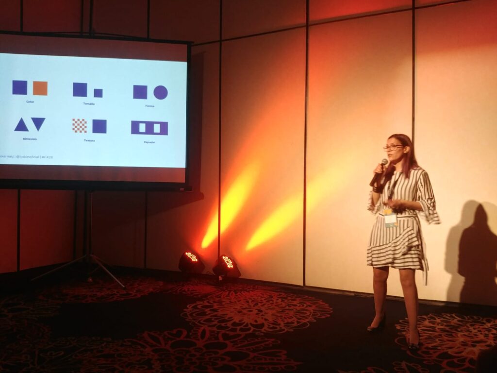
GX282018
And the User? Tips About UX
Presented an introduction to UX with actionable tips for improving user experience in development and QA teams.
More talks & workshops
vOpen.UY2018
Mobile App Design Survival Kit
Workshop covering the complete design process for mobile apps, from ideation and requirements through usability best practices for launch-ready products.
TestingUy2018
Testing User Experience
Hands-on workshop created to help QA and developers integrate UX techniques into their workflow—covering heuristics, task-based usability testing, and foundational analytics.
IxDA Latin America2015
Mastering Paper & Digital Prototyping
Interactive workshop on building and testing both paper and digital prototypes, focused on enabling teams to validate ideas early and effectively.
Courses & instruction
Brightest2020 – Present
Co-creator & Instructor — UXU United
Co-created and teach the UXU (User Experience Certified Ambassador) program, designed to help cross-functional teams strengthen their understanding of UX, usability, and user-centered quality. The program empowers testers, developers, and product teams to incorporate UX thinking into their daily work.
CES2018 – 2020
Co-creator & Instructor — UX for Testers
Developed together with Claudia Badell a course to introduce testers to core UX concepts, giving them practical tools to evaluate user experience, extract meaningful insights, and contribute to overall product quality.
Carne School2018 – 2019
Creator & Instructor — User Experience Foundations
Delivered an introductory course aimed at designers and professionals new to UX. Covered the fundamentals of user experience, the design process, and key tools for shaping user-centered products.
Gallery
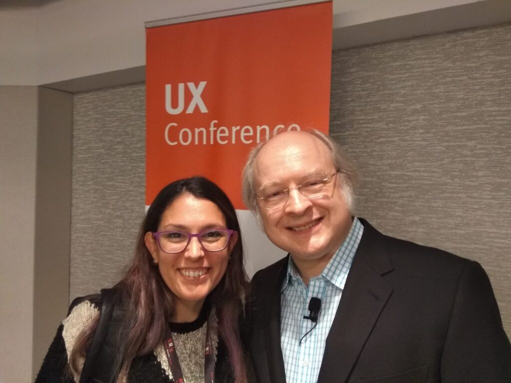
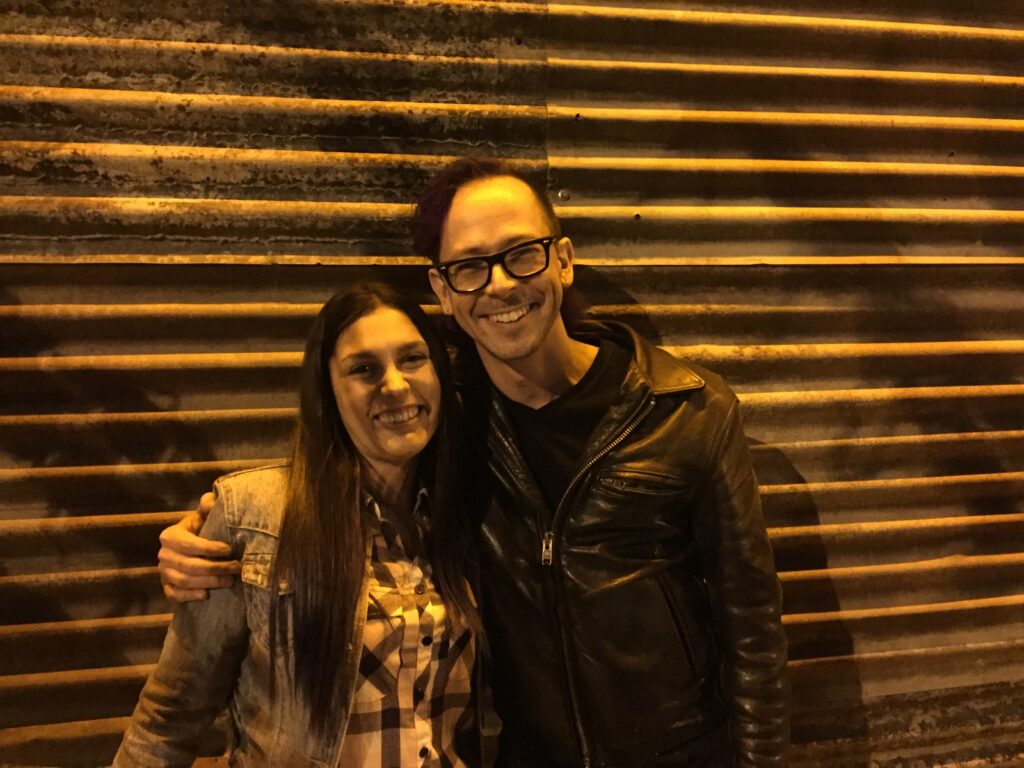
NN/g UX Conference · with Jakob NielsenWith Jesse James Garrett · The Elements of User ExperienceSpeaker · GX28Workshop · usability heuristics in practice
